in Portfolios
I've been working in Krita for some time now. Here is my digital work. Feedback and critique is more than welcome:)

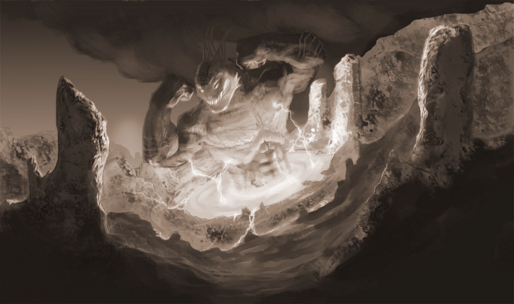
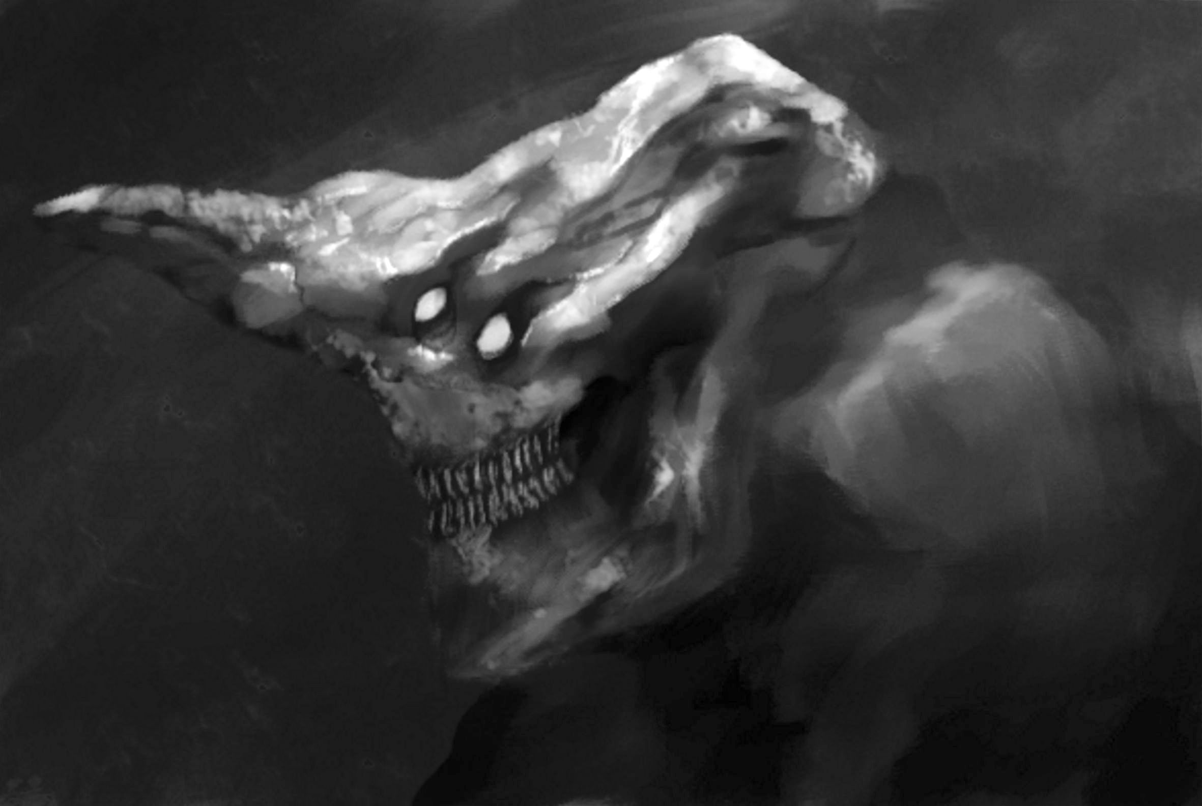
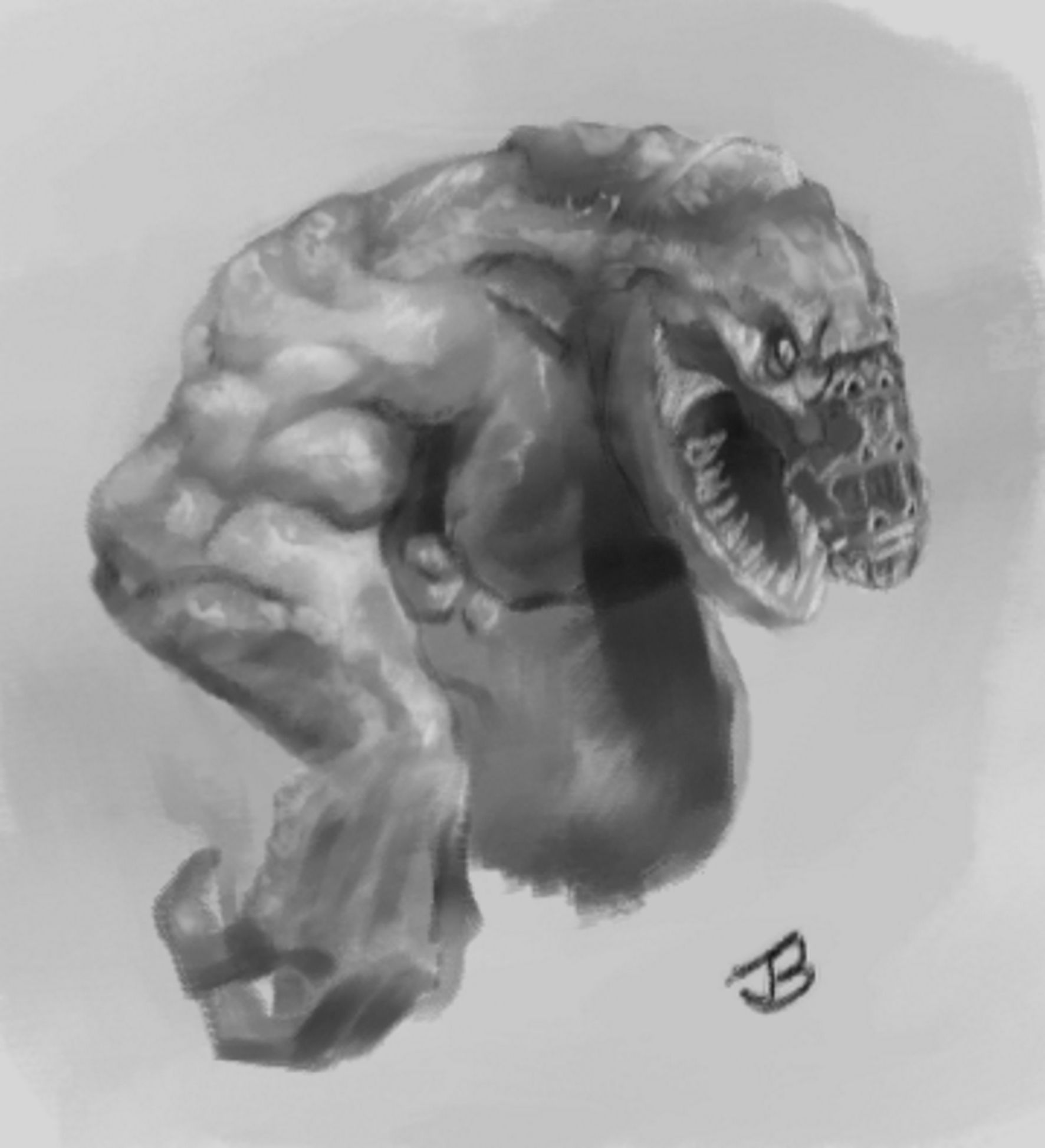
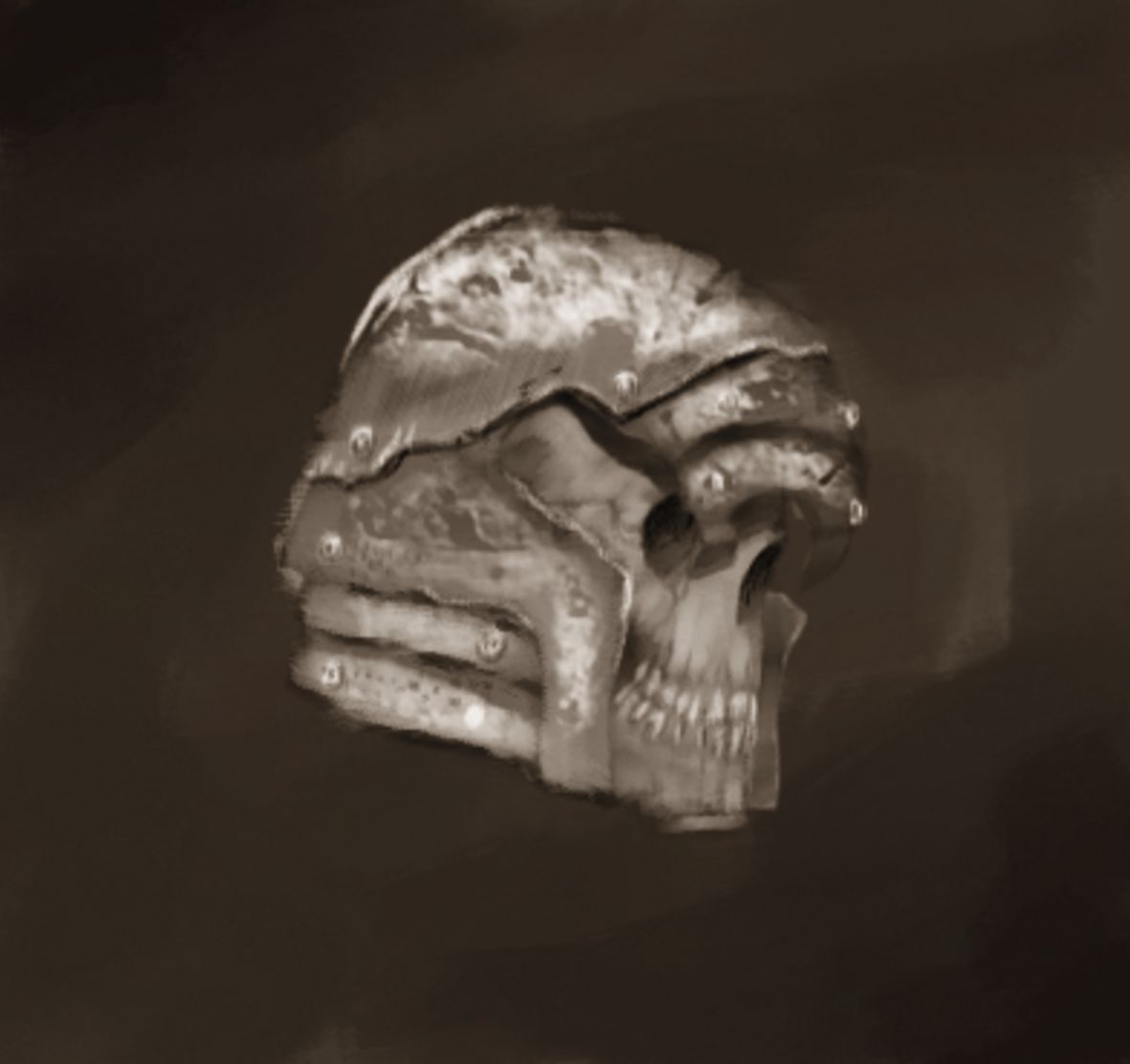


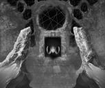

Astan(finished)(grayscale).jpeg
1772 x 1485 - 273K


Abanathi.jpeg
1772 x 1050 - 156K


Monster_one.jpeg
2362 x 1585 - 145K


Altithian(wip).jpeg
1772 x 1945 - 130K


Skull_and_helm.jpeg
1181 x 1112 - 59K

Comments
The idea for this one came from being inspired by Evolve the game and Predator a bit.
Here is another image I finished today.
(With the combination of 90s hotrod gears and pistons inside futuristic machines... 90s-punk I guess)
Very inspiring.
"Make a move."
It is a type of hell/purgatory/dimension which I am striving to inhabit.
Here is a creature concept for Luir:
The idea is that the terrain relates to the characters in an interesting way. If the stairway is more demonic/foreign in relation to the knight and closer in theme to the demon, the knight will be the outsider and vise versa.
On the other hand if the stairway is foreign to both characters, what are they doing there, what is the story being told?
I'm not good at modeling. It's something I haven't practiced at all really.
I'm not an artist by trade, so I don't know how much criticism I show be offering. It seems to me that when you add colour it's more of a suggestion for the kind of colour that the thing should be, rather than a rendering of the colour of the image, or even a proper guide for what colour this thing should actually be should it make it's way into a game (should the Centurion be only slide hue variations of muddy green?).
Images like the Centuron and the Naval Mech feel very underdeveloped in terms of your colouring. Maybe it'd be a good time to practice some colour studies to help that side of your craft catch up with the other bits you seem to be excelling in.
I obviously don't know what aspects of illustration and/or concept art you are trying to get good at. Though I think colour is very important at selling an image to the viewer, and also important in terms of providing colour information for the creation of an asset from a piece of concept art.
For the Centurion and the Naval Mech, I was uncertain how to still preserve the line work and bring in colour. (That's why I made the hues like they are.)
You are right, colour is something I need to practice, theres a lot more I can do there:)
I am currently working on this image:
and here is the planning for the image thusfar:
For this one I need to plan the colour as well, for the type of effect that will enhance the message I'm trying to convey.
Thanx for the awesome input:)
https://youtu.be/tuGThhMI1Yw
Sometimes I get stuck with a design, not knowing how to proceed further. I think it has to do with planning before execution. It's like the initial excitement has left midway through the work.
A solution I believe is to source your own inspiration from sketches and doodles. Like the video in the link above, experience grants confidence and stamina when creating:)
It's interesting the effect of different types of lighting. Lighting also creates mood.
https://gumroad.com/michalkus
This is what I came up with:)
The line drawings are looking awsome
First the planning :)
Here is how far I am:
I would like feedback on this image please :) for the purpose of making it cooler/more awesome, design wise.
Feedback will be highly appreciated.