[SA Game Jam 2019] BioCraft
Project Name: BioCraft
Entry Type: Hobbyist
Team Size: 3 man team
Jam Type: 72 hour jam
Original Download Link:
https://drive.google.com/open?id=1YqBwDISSPl1r8jiyHJyCGAE-7P0E-V8o
Improvements based on comments Download Link:
https://drive.google.com/open?id=1Hxmpcvb8WITIeU7AWc7b_hNXT8yoK5GI
Description
Your homeland is being attacked by waves of enemies, The only thing that is stopping them from barging in, is your beaver barricade. You need to build towers to defend the wall, once the wall gets destroyed you lose the game.
Using the biomes in your homeland you need to search for materials and craft a combination of power-ups and enhancements that can be applied to your defence barricade or your towers. This will allow you to keep the evil forces out.
-----------------------------------------------------------------------------------
BioCraft updates in accordance with community feedback
We would like to thank everyone who took the time to play BioCraft and a special thanks to those who gave feedback. We decided to implement the following changes, updates and bug fixes in accordance with the feedback we received.
A lot of comments we received was with regards to the balance of the game. There were quite a few people that wanted a more challenging experience. The following changes aim to address those sentiments while also adding extra replayability.
- Fixed a bug where the elemental amalgamations hitpoints would not increase between waves
- Changed the increments at which elemental amalgamations hitpoints scale between waves from 5% to 10%
- Limited towers upgrades to 4 upgrades per tower
- Updated controls menu entry to reflect the new tower upgrade system
- Added a leaderboard (please note REST calls might be blocked by certain anti virus programs)
There were concerns of players feeling disconnected from the experience and specifically wanting to be more involved in the action. The following changes should provide a more immersive experience.
- Fixed an issue where the elemental amalgamations would clip through the ramp
- Added an elemental amalgamation attack animation
- Fixed a particle effect causing random visual clutter
- Added a wave counter to the HUD
- Adjusted beaver mesh placement
- Adjusted tower turret rotation
Even though we already display the barrier hitpoints in the HUD there were still some concerns among players of not being able to actively follow the battle while collecting resources. The following update will provide players with an additional option to monitor the battle.
- Added an option to jump to battlefield camera mode
There were concerns with regards to difficulties when collecting resources.
- Enhanced resource collection range
There seemed to be some confusion regarding the camera system. We feel that at least some of the confusion was as a result of not all of the camera keys being listed in the controls menu.
- Added an entry for camera zoom control into the controls menu.
A few players reported getting stuck or caught on trees or other obstacles while collecting resources
- Removed some trees in order to allow for better character movement



WhatsApp Image 2019-09-21 at 10.24.46 AM.jpeg
1280 x 720 - 163K


WhatsApp Image 2019-09-21 at 2.16.44 AM.jpeg
1280 x 1280 - 116K


WhatsApp Image 2019-09-21 at 12.57.07 AM.jpeg
1280 x 1280 - 281K
Thanked by 1PartyPanda
Comments
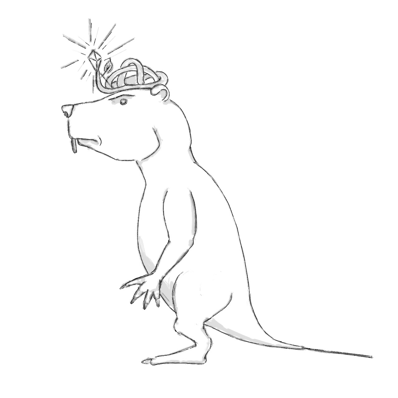
Also can't wait to see the beaver come to life! The character got such a great feel to it :D
The concept is amazing, it's almost like a scaled down tower defense.
The game felt a little easy once I had 3 towers setup and nearly fully upgraded. (I couldn't build a 4th one)
The waves also didn't feel like they're getting harder, reached level 16 by just standing around not doing much.
Would be cool if your towers can only have one upgrade at a time instead of many and enemies getting more hp as the wave level increases.
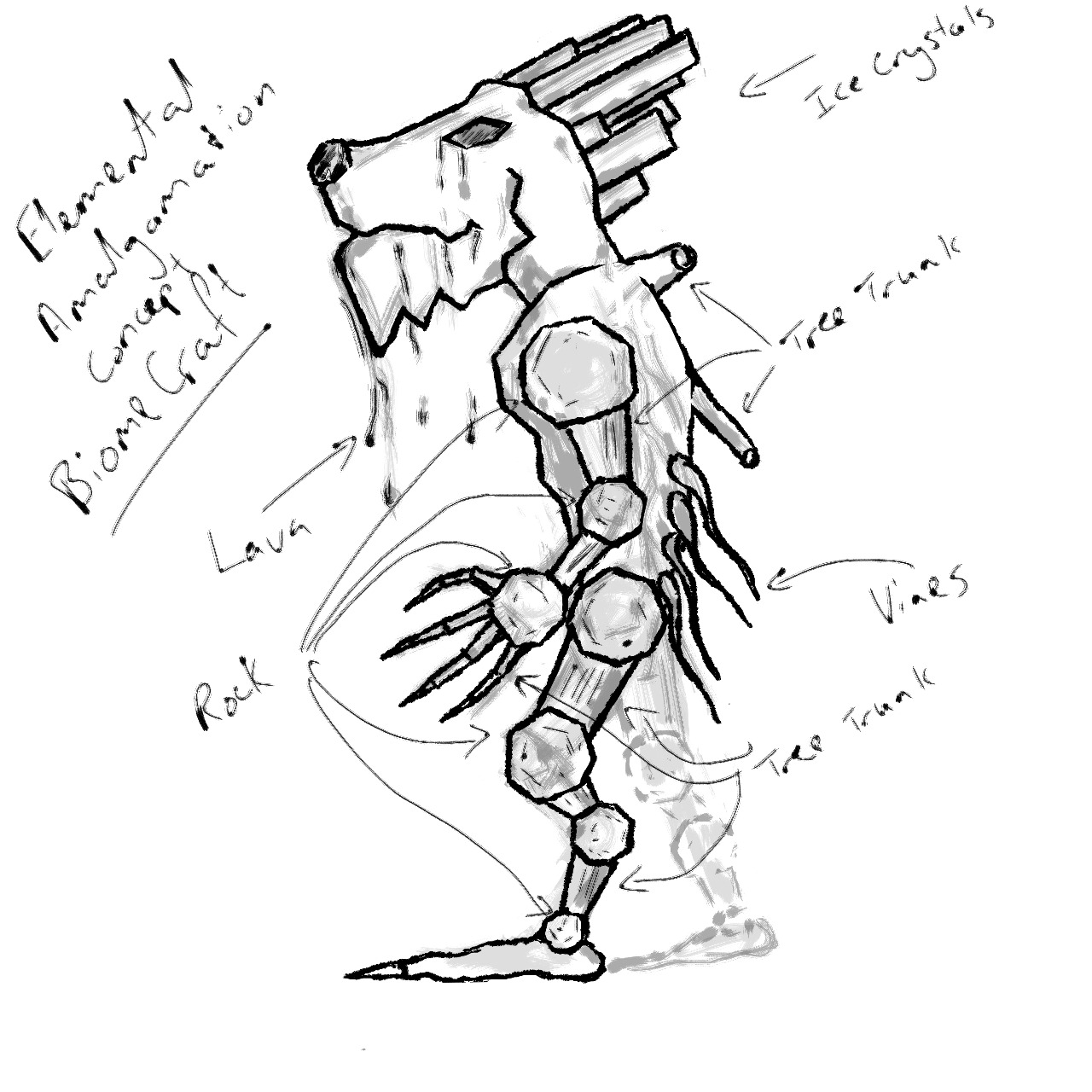
Love the art on the elements.
Perhaps the game could be split into a "Preparation" and "Battle" time so that the player has time to collect resources and gets time to interact with the battle.
I might also be worth ditching the click to move system as it makes the gathering feel even less engaging.
A pass at rebalancing may be good as it takes about 6 waves to get to the point where you could just leave the game to play itself and get to level 50 or so AFK.
I think the game looks very nice. It has a pleasing (and cute) style :) The tower effects were cool and the moment I read "meteors" I ran to the obsidian as fast as possible.
The point and click, while fine for moving, felt a bit annoying when gathering resources. I'm used to playing MOBA's where I constantly spam click to move and found it unsatisfying to gather resources (as I constantly misclicked).
I'd also love to have a separate build and wave attack phase (maybe the camera can show you an overview of the battle while in attack phase?). Also as much as I'd like to think I'm just a great player, the wave difficulty doesn't seem to scale fast enough.
Despite the few comments - I still enjoyed playing it :) The game runs very smoothly and everything I played around with worked well and felt "polished".
Once again thanks for the comments guys, they are constructive and very helpful to us!
The only issues I had was with constant misclicking when gathering resources, and occasionally getting stuck on the trees bordering the areas.
Despite that I really enjoyed it.
It took me a while to figure out where exactly to mine resources. Initially I walked up to the first tree and spent a while trying to chop it down. Eventually figured out there are resource "gardens".
There were a few minor bugs like sometimes being unable to build a second tower, or clicking on one of the UI items and having the character move off to that space in the world (I assume the click passed through the UI to the world space).
Like @eviL_joSh said, I'd love a to have more interaction with the environment. In tower defense games where I'm controlling a character (instead of just placing towers) I have a desire to have my character interact with the environment and the waves.
Overall it felt really polished for a jam game!
Initially I had trouble finding out exactly what the resources were and the camera started off facing the resource gathering area so I didn't know where the enemies were coming from (I had to lose a round to realise it).
Also I noticed that on the bridge I would run back and forth when trying to get to a position by holding in the left mouse button and sometimes terrain would be in the way of me clicking onto a position that I would like to go to.
I know I sound like I'm being a bit much but I really did enjoy it and I couldn't believe all this could be done on just a single weekend!
One thing I think is lacking is a visual indication of what is happening with my barricade when I'm off gathering materials. I can see the health, but I can't really see how effective my towers are at dealing with the enemies unless I'm there when it happens, which makes it somewhat difficult to gauge what I need to do next.
Aside from that however, the art was lovely, the gameplay works perfectly fine, and the towers looked really nice alongside the theme you guys chose aesthetically.
Well done, guys!
The game definitely feels more challenging, which I enjoyed. The scoreboard was also a nice touch and allowed me to set a goal for myself (which I didn't achieve and made my failure/success carry much more weight.
Very happy with the overview camera :D