[WIP] Unnamed platformer - Artwork style

edited in Projects
Thought I'd get a quick idea on what everyone thinks about this for an artwork style for the platformer I'm currently working on. Obviously just a quick mockup, but you should get a rough idea. I've been really stuck trying to decide on a visual style for the game, and I'm hoping this would be something a bit different. Will give more info on the story and stuff in the coming weeks.
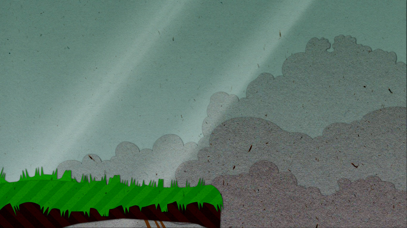
image
001.jpg
1366 x 768 - 281K

Comments

  • Very moody and beautiful! I really like the background, and the use of shape. The cut out style is also really working well. I do however find that the colour and pattern on the forground is overwhelming. Consider using plain colour fill? Or maybe more muted colours? This may help accentuate the texture more (like it has on the clouds).

    I look forward to seeing more :)
  • Cool, yeah. I definitely need to tone the foreground colours down a bit - it should be a lot more moody. You're right about the diagonal pattern as well, I reckon. That area would obviously be a lot more busy with extra details like plants/rocks/powerups/etc. so that pattern would make it look like a mess. Thanks @hanli.
  • Love it. I'm with hanli on the foreground. The bg is nice and grungy whereas the fg deviates from that.
  • Cool - thanks @bigbadwofl. The main idea is (kinda) Kingdom Hearts meets Ice Climber, so the aim would be to be almost cute (hence the paper cutout style) but with a sinister undertone (that's what I always got from KH, maybe it's just me).
  • I see what you mean. Perhaps keeping the bright colors of the FG but giving it a bit of a dirty overlay would get that across better?
  • I'll try both and see what works. This was quite a quick mockup, so obviously adding in the player and all the other little extras will also make a big difference. But nailing the colour palette will be a step in the right direction. I think it would work better changing those FG colours out though. I made a mockup of the FG in a more pixel-art style as well (below) where the FG is darker and it works a lot better.

    image
    002.jpg
    1366 x 768 - 49K
  • What will you be developing in? Tip: don't say C++ ;)

    Joke Reference
  • Hahaha! Nah, I'll probably just do this one in Construct. I've done a couple of working prototypes in Python/Pygame - so it is tempting to do it in that, but I'm still learning Python so it's a lot more difficult to get it to do what I want. So, for this version I'll do it in Construct as it seems to be able do everything I need. Next one I'll do Python - maybe a top down arcade shooter.
  • edited
    Cool stuff. Construct is an HTML5 + JS engine right? I wrote a JS engine for my game Morf and I loved it. Something about the simplicity and freedom of JS just gets me in a creative mood.

    EDIT: Any chance of you making a devblog? They're like crack to me. Especially ones written by people just starting out.
  • Construct 2 is HTML5, yeah. I'm doing this in Construct Classic though, so it exports DirectX 9 executables. I'd love to do a future game in C2 though, as you could publish straight to most mobile devices (HUGE bonus).

    A DevBlog is a pretty good idea actually. Will see if I can sommer add it as a page on my portfolio site. Will keep you updated.
  • I'll try both and see what works. This was quite a quick mockup, so obviously adding in the player and all the other little extras will also make a big difference.
    This! :)

    As you say, I'd just throw stuff in there -- everything you might need, including HUD/buttons if you need them -- before deciding on anything. Also helps with not being precious about anything before the palette with all of its components works.

    And while I like the paper texture in the clouds, you might find that if it's a game that scrolls a lot (as many platformers do), you may get shimmering and noisiness that makes your eyes bleed when you scroll. I dunno what game you're making, but its being noisy obviously fights its being a background element.

    I feel stupid saying this stuff, because I think they're things you already know! :D
  • Thanks for the great feedback @Elyaradine. Don't assume too much about my knowledge, haha. These discussions are awesome, as it does help with being objective about what is being worked on. :)

    Being "precious" is the big problem though, isn't it? Curse of the designer, I guess.
  • Last update before I head back into the shed...


    image
    003.jpg
    1366 x 768 - 258K
    Thanked by 2hanli Bensonance
  • Ah yes. Much, much better. Love the palette you've decided on.

    What happens in the shed?
    Thanked by 1hanli
  • I think that this is now working really well. Great!
  • Oh @bigbadwofl - you really don't want to know. ;)
  • I really love that final mock-up :D.

    If you were to make your player character really cute, bright and colorful the contrast would be really unsettling against that world :). Which is what I gathered you were after from your previous posts :).
  • Without giving away too much backstory just yet, the world looks that way because of the bad guys. So your character - being the good guy - wouldn't look quite as desaturated, but would still fit in with the style. It's gonna take a bit of trial and error, but that's what I'm aiming for. ;)

    [Little Big Adventure is actually another quite good example of what I'm aiming for. If you ever played LBA2 (which you really should, if you haven't yet) you'll remember how Twinsun was all rainy and gloomy in the beginning of the game until you completed the first mission.
  • The change from the first to the last was actually noticeable :) The second one... I dunno what it's supposed to be, looked glitched! Though if that's the effect you're going for that's also cool :)

    The final last one - just one comment - you've used real paper textures to give it a "physical" feel, however the edges and the shadows are a tad too clinical and perfect to seem physical, and the two aspects feels a little at odds with one another. If you could make it more "handcrafted" - with perhaps varied shadows, edges that are less "straight", maybe slight white edges, bits that look like an imperfect cut, it'll fit the physical texture even better.

    Really nitpicky, but thought it would be great to see it with just a little more push! :)
  • Haha, nitpicky is good! Thanks man. :)

    (2nd one was just as an example of a different colour scheme for the foreground stuff. (The crazy colours were just placeholders - sorry, should have made more clear.)
  • Character Sprite WIP...

    image
    animated_gif.gif
    203 x 181 - 28K
  • Given the size of your platforms, I feel you might need to emphasise your character's movements quite a lot more. You've got a cape that obscures a lot of movement, try to give it more flow - use lean to give your character a feeling of purposeful movement if at all possible.

    I wish I had better ways to explain what I'm talking about, but that's what I would tell an artist who sent me that for my game ;)
    Thanked by 2hanli hellojaco
  • It's really cool. I think Danny has nailed it. Accentuate the movement by using the cape to better effect. See if you can find more reference material? Jono would be best placed to help with this I think.
    Thanked by 1hellojaco
  • Thanks guys! Character animation isn't my strongest point, so any tips are appreciated. (I even went out and bought Rayman Origins this weekend, for some inspiration. Not a great game, but fantastic artwork/animation.) But yeah, your suggestions sound on the money. Would also suit the character if his movement was a little bit more O.T.T.

    I've started using Spriter, as it makes the tweening a bit easier - although I suspect I'm going to have to clean up the frames in PhotoShop afterwards again as Spriter leaves a lot of aliasing artifacts. Not sure if it would be easier to just do the animation in Flash with the bone tool. (Might be tricky with the cape.) Any tips on the software/workflow front?
Sign In or Register to comment.