Steam Greenlight icons, descriptions, etc. (Warning: lot's of images)
As we're going into Greenlight soon, I've been looking at a lot of games on GL to try work out what is good/bad.
I typed out notes while doing that, so I figured I might as well post them here. This is just my personal preference of stuff, but at the very least you'll now know the opinion of some random guy on the internet.
From the amount of crap that actually gets greenlit, I'm not sure any of this is worth it, but there isn't much choice.
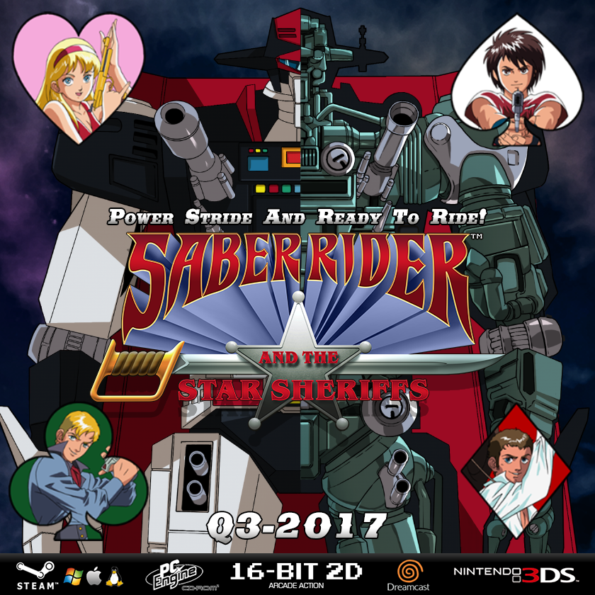
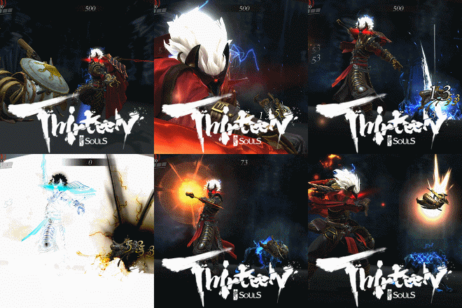
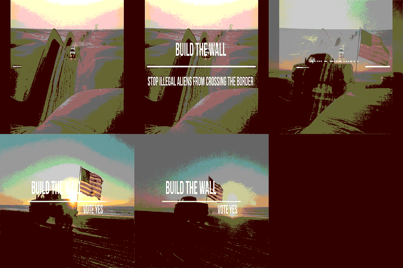
Bad Icons
Generally, icons that I wouldn't consider clicking had:
- Just a game title. Which, considering I don't know the game, tells me nothing
- Enough elements (be it text or images) that it is hard to know what is going on
- No information about the game
- Icons that showed obvious min-effort
- Girls in skimpy clothing. My brain automatically assumes that if you need to sell a game with T&A, then it probably isn't a great game.
There are tons of min-effort examples, but these were ones that were bad because of descisions, not due to lack of skill.



Good icons
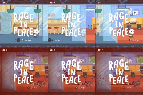
Icons that interested me enough to click them had one of more of these things:
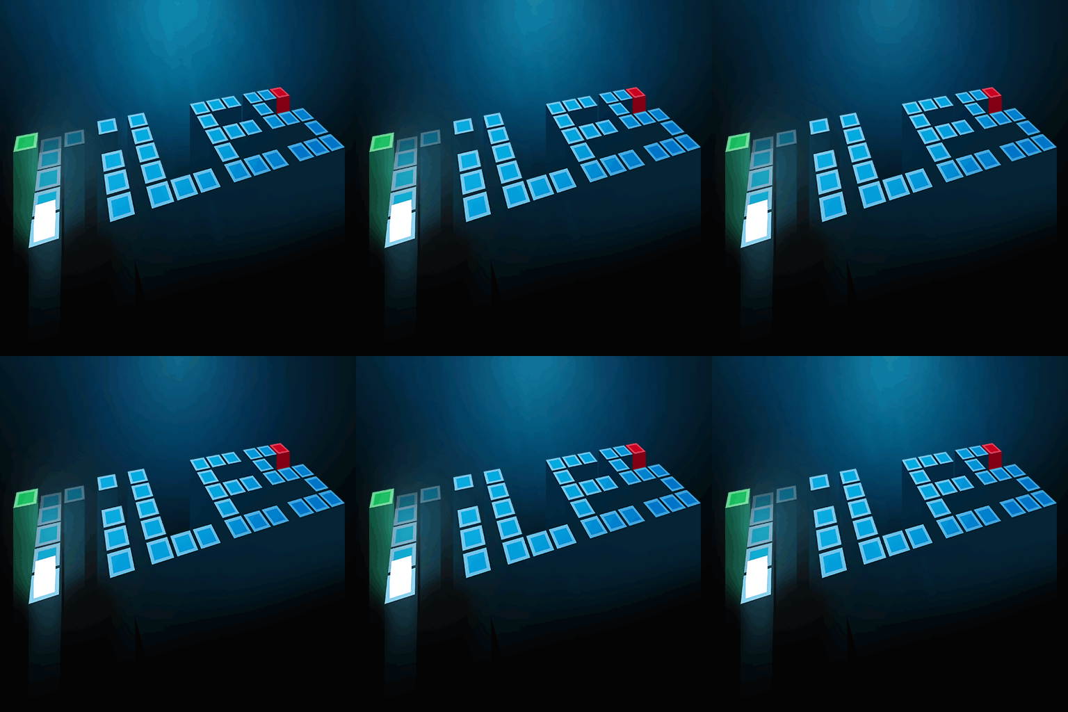
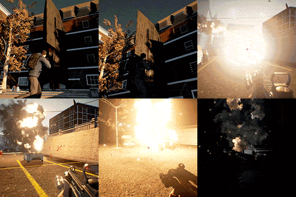
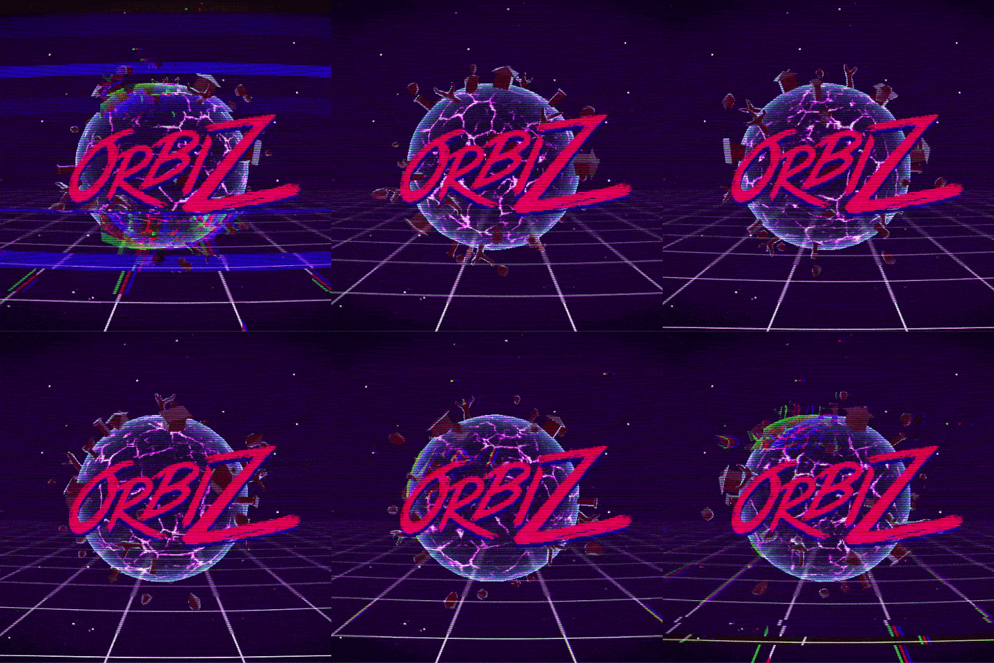
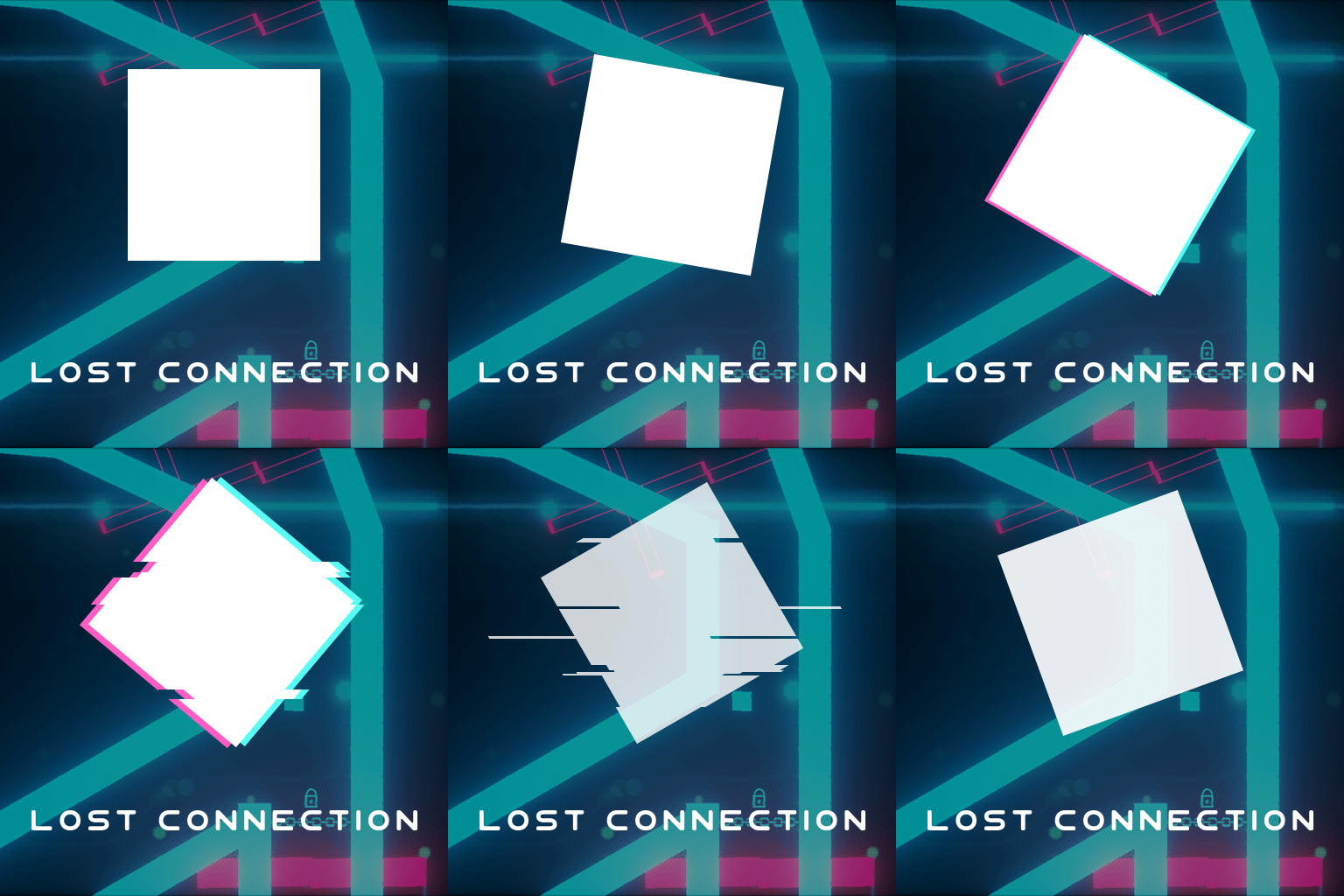
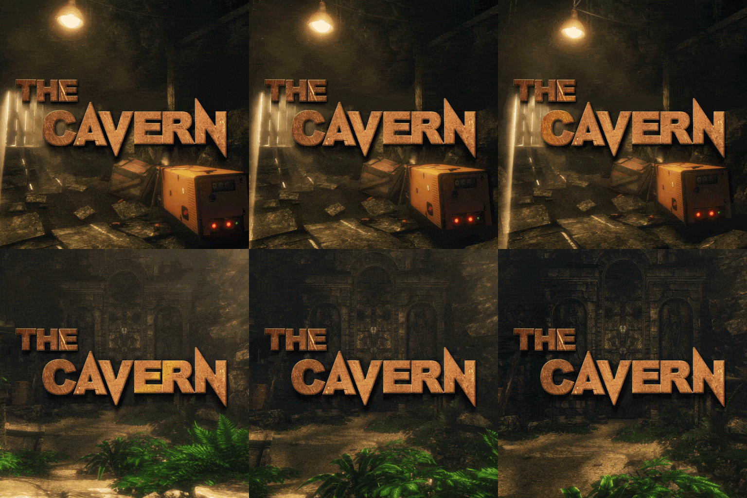
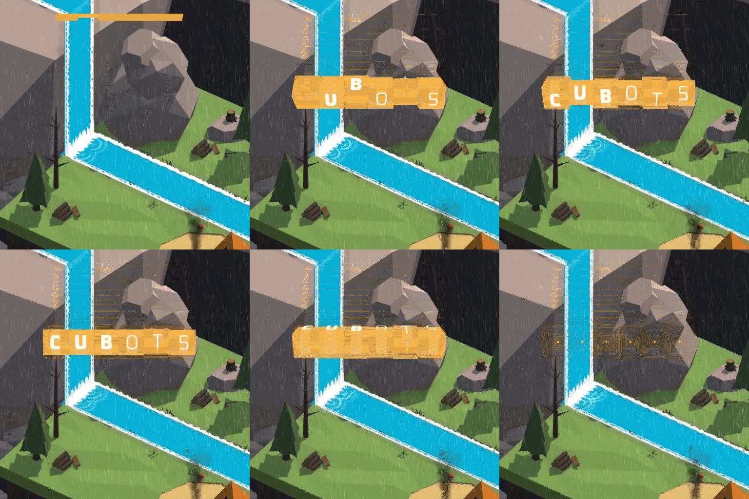
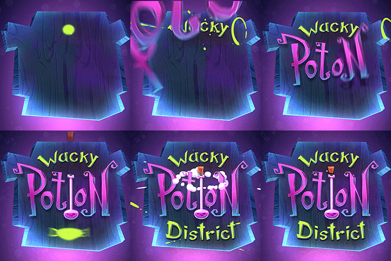
- A good GIF. Movement is just obviously more noticeable, but it also gives you more time to show some of the game.
- Clear title. I don't know why I wanted them to have the title on the image, but the ones without it attracted me less.
- Clear what is going on
- Shows roughly what style of game it is, or what the game is about
The icon we made for VALA (posted in the VALA thread), satisfies all of these (IMO :P).


Something interesting to note about icons, is that the specs (512x512 and < 1MB) that the GL submission page says are actually wrong. It can be up to 2MB (according to the error message that pops up when you try submit one over 2MB), and can be any (?) resolution.
I also watched tons of trailers. Here are some points I wrote:
- Should go almost immediately into gameplay
- Minimal story elements - this is greenlight, I don't care about the story yet
- 2 minutes is too long. 1:30 is probably around the max it should be
- Don't waste the first 10 seconds showing logo's and such. Do it at the end.
- Music, especially when well timed makes a mediocre trailer into a really good one
- Framerate matters a lot. Lot's of comments and complaints about video with crappy framerate. There really isn't any excuse for it.
- Don't show the game engine name. Why do I care what you made it in?
Trailers I'd consider good:
https://steamcommunity.com/sharedfiles/filedetails/?id=813827321 (this breaks most of what I just mentioned, but the editing is really good)
https://steamcommunity.com/sharedfiles/filedetails/?id=817836436 (I think the music works great here)
Descriptions:
- Big walls of text look crappy
- Splitting description into sections with a graphic heading looks good
- Don't use lots of images, since there are screenshots at the top. But a few GIFs can work
- The type of game (i.e topdown twinstick) should be in the first sentence. It is what shows when you hover over an icon.
Although I think it is too long, and goes into detail that I don't care about (i.e. the credits), I think this description is pretty good https://steamcommunity.com/sharedfiles/filedetails/?id=817836436
I typed out notes while doing that, so I figured I might as well post them here. This is just my personal preference of stuff, but at the very least you'll now know the opinion of some random guy on the internet.
From the amount of crap that actually gets greenlit, I'm not sure any of this is worth it, but there isn't much choice.
Bad Icons
Generally, icons that I wouldn't consider clicking had:
- Just a game title. Which, considering I don't know the game, tells me nothing
- Enough elements (be it text or images) that it is hard to know what is going on
- No information about the game
- Icons that showed obvious min-effort
- Girls in skimpy clothing. My brain automatically assumes that if you need to sell a game with T&A, then it probably isn't a great game.
There are tons of min-effort examples, but these were ones that were bad because of descisions, not due to lack of skill.


Good icons
Icons that interested me enough to click them had one of more of these things:
- A good GIF. Movement is just obviously more noticeable, but it also gives you more time to show some of the game.
- Clear title. I don't know why I wanted them to have the title on the image, but the ones without it attracted me less.
- Clear what is going on
- Shows roughly what style of game it is, or what the game is about
The icon we made for VALA (posted in the VALA thread), satisfies all of these (IMO :P).


Something interesting to note about icons, is that the specs (512x512 and < 1MB) that the GL submission page says are actually wrong. It can be up to 2MB (according to the error message that pops up when you try submit one over 2MB), and can be any (?) resolution.
I also watched tons of trailers. Here are some points I wrote:
- Should go almost immediately into gameplay
- Minimal story elements - this is greenlight, I don't care about the story yet
- 2 minutes is too long. 1:30 is probably around the max it should be
- Don't waste the first 10 seconds showing logo's and such. Do it at the end.
- Music, especially when well timed makes a mediocre trailer into a really good one
- Framerate matters a lot. Lot's of comments and complaints about video with crappy framerate. There really isn't any excuse for it.
- Don't show the game engine name. Why do I care what you made it in?
Trailers I'd consider good:
https://steamcommunity.com/sharedfiles/filedetails/?id=813827321 (this breaks most of what I just mentioned, but the editing is really good)
https://steamcommunity.com/sharedfiles/filedetails/?id=817836436 (I think the music works great here)
Descriptions:
- Big walls of text look crappy
- Splitting description into sections with a graphic heading looks good
- Don't use lots of images, since there are screenshots at the top. But a few GIFs can work
- The type of game (i.e topdown twinstick) should be in the first sentence. It is what shows when you hover over an icon.
Although I think it is too long, and goes into detail that I don't care about (i.e. the credits), I think this description is pretty good https://steamcommunity.com/sharedfiles/filedetails/?id=817836436

Comments
could I ask you what software you used to make your VALA Greenlight Icon?
The Icons I found drew my attention the most were, firstly Animated Gif icons. And then of those i found the best ones showed a little gameplay if the gameplay was visually attractive. Most of the games I clicked on had an icon that gave you a little bit of an idea of what the game is about.
So after looking at you post again @roguecode it seems i agree with you. :)
Goodluck with Greenlight!
Karl