Artdump for feedback [SabreKitty]

Hey!
I wanted to create an art dump for myself where I frequently upload art I am working on it get input/ ideas.
I often find I will start doing something and get stuck and never complete it, so I thought that some guidance might be helpful.
On top of that, this is a place where people can see what I can do :)
I will be trying to upload frequently and constantly do more work.
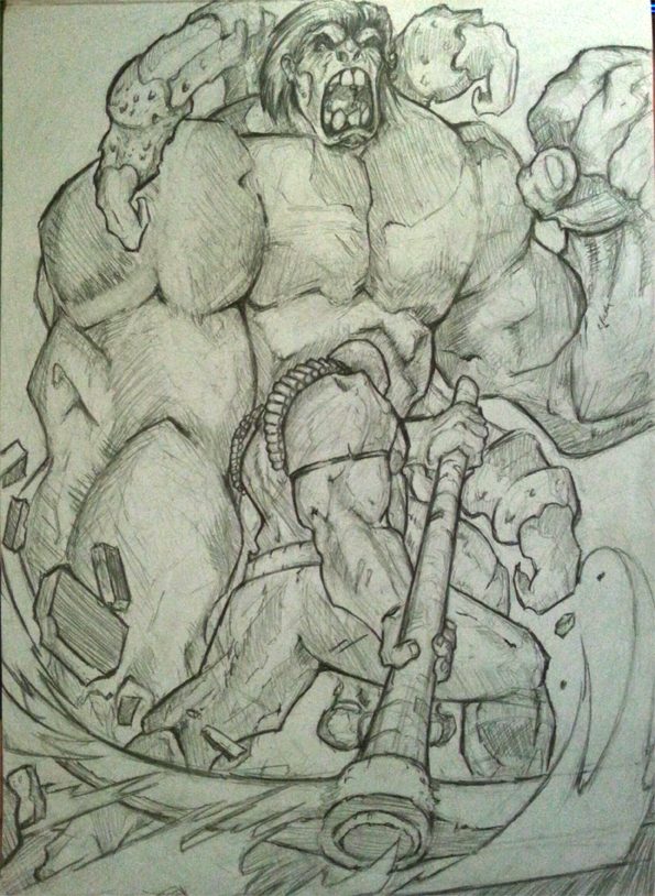
I feel like I am struggling how to light and render properly in the above image.
I aspire to be like my favourite comicbook artists (Jim Lee, Joe Mad) and also take some inspirations from Sam Wise and various other Blizzard artists.
Have an epic Monday!
I wanted to create an art dump for myself where I frequently upload art I am working on it get input/ ideas.
I often find I will start doing something and get stuck and never complete it, so I thought that some guidance might be helpful.
On top of that, this is a place where people can see what I can do :)
I will be trying to upload frequently and constantly do more work.
I feel like I am struggling how to light and render properly in the above image.
I aspire to be like my favourite comicbook artists (Jim Lee, Joe Mad) and also take some inspirations from Sam Wise and various other Blizzard artists.
Have an epic Monday!
got one of those things after me.jpg
595 x 814 - 478K
Comments
I don't think my scribbles got across what I was hoping for in more diagonal lines across the whole piece.
Keep on keepin on! I Hope to see more of your work appear here :D
This is such a helpful breakdown, you put a lot of effort into that :)
I will probably be working on a backdrop as my next large drawing this week, its by far my weakest field, but I will try do a small character interaction work on these points you mentioned.
I'm not an expert, but since you've asked for feedback, here's some on the strong model piece. :)
Wow thanks for all the awesome feedback :) its really helpful as I try to become a better artist :)
more work will be coming soon! :)
I think your anatomy could use some work, especially in the arms.
I did infact update it because I wasn't happy with the right arm:
http://other00.deviantart.net/d96e/o/2016/026/6/6/662861c73142e8775059db43540906e6.jpg
Its tricky when you are doing bloated musculature what the right balance is :)
Passing on some paraphrased stuff that he said to me: Biggest things to improve in your work right now are perspective and anatomy. In terms of anatomy, he did a lot of figure drawing, and figure studies. He says that knowing anatomy is even more important when you're doing stylised/exaggerated work, because you need to know enough of reality to make the stylised work look as if it could actually function. You need to know what you're exaggerating, or what you're simplifying. (He gives the Disney Infinity sculpts as an example of very stylised work that looks as if it'd function.)
I dig your style though; there's this over-the-top fearlessness and personality that you seem to be getting wonderfully that I've always struggled to capture. :)
So, in addition to just continuing with drawing a lot of stuff that you enjoy, I'd suggest doing some simpler drawings where you're drawing figures but using primitive shapes (like cylinders), and drawing cylinders and boxes in perspective in the same scene. And also include some studies of nudes/muscles/anatomical/ecorche drawings.
There's a DVD set that I thought was pretty great for my own inspiration that might interest you. It's a 3-DVD set by David Finch recorded for the Gnomon Workshop.
http://www.thegnomonworkshop.com/store/product/823/Dynamic-Figure-Drawing:-The-Body#.VqgHHvn5hhE
[edit] I don't think my arm anatomy's quite right either, and I think I lost a bit of the nice personality that yours had, but I did a paint over anyway. :P In particular, I think your arms are pretty disconnected from the body. At the shoulder, there's a bunch of stuff intertwining, including the pex and the latissimus dorsi flap. I think it's also pretty important to show where the elbow is, partly because it's bony and hard and is likely to create some harder light transitions (so I'd expect it to show up more obviously in stylised work). I went and shaded the whole thing to try and show the forms, but take from it what you will.
I will check out that DVD, looks amazing.
See you at the meet up tonight if you are coming.
Think of the human body as like an action figure. Where the arms connect to the torso is a connection socket. If you consider the 3D forms of your drawing, it looks like your arms would not be joining up to the connection sockets in the torso.
What can be really helpful, besides practicing anatomy (real figures, not from comics or stylized works) is to use reference. The easiest reference is a mirror! Stand in front of it, now tilt your torso 45 degress. Notice how your arms and particularly your shoulders shift relative to your viewpoint. The furthest shoulder recedes behind your torso, the one closest moves forward to block it.
Conveying this gives the illusion of depth in paintings. Failing to convey it will read as "off", regardless of what style you're working in.
I've manipulated your image a bit in photoshop to illustrate what I mean. There's a limit to what I can do with that, but you get the idea, I hope.
Changes: I moved her left arm forward, right arm back, gave her chestplate more mass and brought her head down to emphasize the bulky armor and neck guard. I added a pauldron on the right shoulder to bulk out the silhouette on that side and made sure that her right bicep looked like it was going in under that pauldron, not forming a line with it in the silhouette.
Hope that helps. :)
I will internalize it all into my next works.
Ya'll awesome.
Not neat but crits will help :)
My Puzzle layout for the game jam game I was part of "Totem".
The plan is to do this every day in vast quantities, while doing my other stuffs.
Please note, I am terrible at giving tips and teaching, and I know I am skipping a lot of steps out of habit since I have been doing it for so long, so please, other artists, ask questions. Anything to make it easier. Ok, onto the images.
ok, in regards to the first image (but it does cover both), I think the first thing to concentrate on is not relying on shading so early on. concentrating on tones and value so early can only make things harder and more confusing. So when you do the initial drawing, don't worry about spotting blacks or rendering the piece. That comes afterwards, and is way more simple to set up lighting after you know how it is laid out.
Another universal piece of advice, especially when it comes to full illustrations like the second image, is thumb-nailing early on by finding a composition that works for you. It saves on a lot of time and redoing work in the future. This is also great when doing client work, since you can just show early layouts without going into final production on the image, only to find out that the client doesn't like it, or wants it shot from a different angle.
Thumbnails keeps everyone happy.
Ok, the first image.
So the design is strong, with only a couple of changes here.
The proportions can work, if you just keep a couple of things in mind. First the scale of the hands and feet. making them a tad larger to compensate for the drastic change in proportion will help sell it better. Anatomy does not go out of the window just because you are deforming something or dealing with a fantasy creature.
Illustration is all about lying to the audience. You need to place things that the person viewing it can recognize enough to suspend their disbelief.
when it comes to scaling the hands/feet, I use wrist to hand ratio, where the thickness of the wrist determines the size of the hand. This is only a stylistic approach, since the true scale is face to hand ratio. Again, I do a lot of wrong things, and take short cuts that make the images look better, but confuse a lot of other things (I am not a great example of doing things right :P )
Also, what I did, was make a shape language. What that means are that all the shapes are very similar to each other, IE. rounded shapes with slight edges to accentuate certain areas.
Whereas the initial image has alot of differing shapes, the sharp horns and ears fighting with the roundness of the rest of the body. It makes the image easier to read and far less noisy.
Ok, onto the next image.
A lot things here are applicable to the previous image as well.
So the initial layout is a tab problematic, this can easily be solved by thumb-nailing. The BG is a tad out of wack, reading as a birds eye view shot, implying that foreground guy is floating in the air. Starting with foreground guy, drawing someone from the back is usually only reserved for implying scale, and is very hard to convey emotion or reaction, so you have to use a lot of body positioning and posture to show what the character is feeling/reaction.
making him more hunched over, arms spread out makes him feel ready to absorb the hit.
Also the fact that he is such a large part of the composition, I turned him from a focus point into a framing device, locking in the focus point that is the character coming at him.
Putting them on the same level also makes it easier to see that they are similar in scale, and then making the body larger than the head in a big way makes it feel that he is bigger than her still.
Also, I over exaggerated her sprint a tad to show urgency.
I turned her head to face the viewer and then made her eyes view the opponent to show that she is rushing him down, that he is the target, not us. It's a trick, and one I fall back on to cheat. It is not recommended.
Thats the basics of it, and PLEASE, ask questions, and other experienced artists, add your 2 cents, the more the merrier.
Thanks!
You've given me a whole plethora of advice and things to consider when I do my next works.
I am incredibly grateful and will take heed of your changes and try to copy your pdfs as practice and breakdowns.
Seriously thanks :)
Soo awesome (squees a little bit)
I feel a lot less productive than yesterday.
Work from last week.
Character Studies, Life speed Drawing, an unfinished background, Digital warm-ups, and A boat....