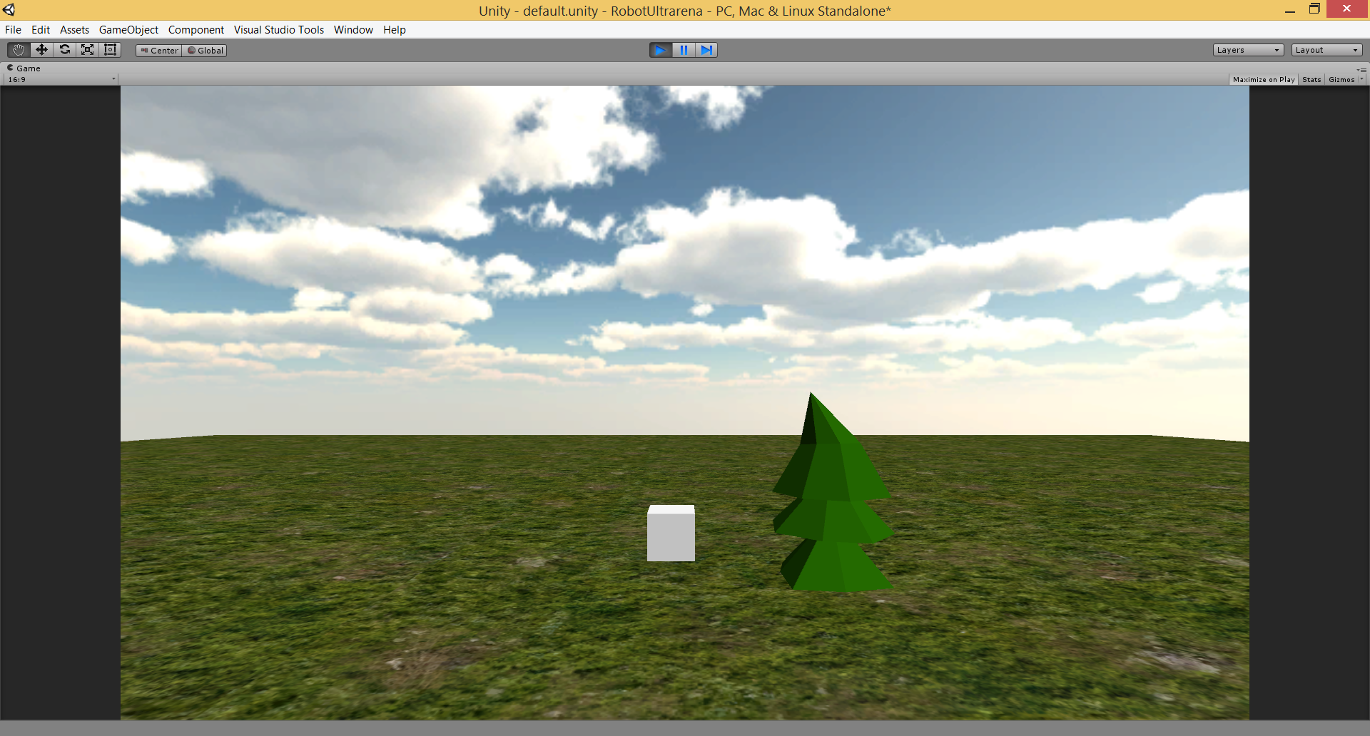
I think the biggest problem is the form of the model. Your lower cones are similar size to the higher ones, instead of tapering off in scale. The edges at the base of the cone are also super straight, rather than more organic.
In terms of the shading, you'd get a much better result by designing your lights better, casting shadows, changing shadow intensity, playing with the angle, colour and intensity of your directional light, comparing that to your ambient/sky light, and potentially baking that stuff in a lightmap for some bounce and/or ao. Lighting is really important: everything you see is a function of it.
A lot of this is just knowing what you actually want something to look like (i.e. designing your forms, colours and lighting), but if you want it to look like Splice, and you're doing this to learn, you may get the most out of trying to copy everything about the Splice trees as closely as you can with all of those. (It's probably not helping that you've got flat-shaded models next to a photo-texture.)
@Fengol Cool! I'd agree with @Elyaradine, particularly about the form of the cones and edges, and its placement on the photo texture creating a harsh contrast in detail. Getting the lighting right too would definitely add a lot to the look. I haven't played around too much with ambient occlusion and lightmap baking, but I've seen plenty of games using a low poly, flat shaded style that look 100 times better with amazing physically-based lighting: (Incidentally, this comes from an old reddit post that seems to have some cool information on this style reddit.com/r/gamedev/comments/1203mf/very_low_poly_art)
I figured out there's fractal option in Blender's subdivide and it's made such a difference. Here's a screencap of yesterday's tree next to today's one.

Comments
In terms of the shading, you'd get a much better result by designing your lights better, casting shadows, changing shadow intensity, playing with the angle, colour and intensity of your directional light, comparing that to your ambient/sky light, and potentially baking that stuff in a lightmap for some bounce and/or ao. Lighting is really important: everything you see is a function of it.
A lot of this is just knowing what you actually want something to look like (i.e. designing your forms, colours and lighting), but if you want it to look like Splice, and you're doing this to learn, you may get the most out of trying to copy everything about the Splice trees as closely as you can with all of those. (It's probably not helping that you've got flat-shaded models next to a photo-texture.)
Getting the lighting right too would definitely add a lot to the look. I haven't played around too much with ambient occlusion and lightmap baking, but I've seen plenty of games using a low poly, flat shaded style that look 100 times better with amazing physically-based lighting:
(Incidentally, this comes from an old reddit post that seems to have some cool information on this style reddit.com/r/gamedev/comments/1203mf/very_low_poly_art)
Anyway, here's a link to the blender files for the trees and rocks in Splice in case you want to have a closer look at them
https://dropbox.com/sh/y34uxgvat85pm4l/AABW6cQTP3gWbMsPjCs1KUY-a?dl=0
Enjoy, and I hope it helps!
Thanks for all the help and resources!