Graphics Person: My website could use some critical feedback before I start pimping it.

Heeeeeeeey guys.
The 2D guy is busy getting his shiz sorted for a drastic career move. My stuff isn't tailored towards the gaming industry, but think the feedback could still help me a great deal if you'd be willing. http://www.wesselmatthews.com/
As part of my pimping-my-wares campaign I've also launched a Facebook page where I'll be uploading stuff at least every other day. I'm currently just working on a bunch or requests from friends for fun, improving and experience, and though the list is a bit overwhelming right now spots should open again later this week. https://www.facebook.com/wesselmatthewsillustration
If you like what I do and wanna see more, please like. More importantly though, any advice, tips and feedback would leave me indebted.
Wes

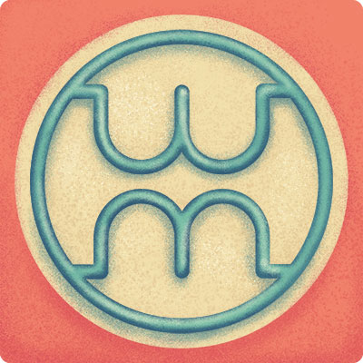
Logo.jpg
400 x 400 - 46K
Thanked by 1hanli
Comments
The link in your post doesn't work; you have to add the "http://" to your link so it doesn't still point to a MGSA's local domain.
In terms of site layout for game artists, it's usually recommended to have it as one large, scrolling page, no thumbnails. While this is normally terrible web design because of bandwidth and such, your game art portfolio is often only searched for when someone's looking to hire, and at that point it's likely to be someone who's got a whole bunch of tabs open, with a portfolio in each. It's just a pain for them to have to click on an image, click back, etc. when it's a lot easier just to scroll right down and have a good overall impression of whether to pass the link on to the art director or not.
So, one page design, scroll down and see image goodness, and really obvious contact details, with a link to a resume/CV or something. Example
I get that you may be casting your net wider than just games though, in which case the layout stuff might not be as relevant. Because aside from that it looks nice.
I get what you're saying with the one page scroller. As you've noted, I am casting a wide net, so I'd like to keep the gallery in tact where you can jump to where you're interested in, but if I make a dedicated scroller page for gaming people? It'd repeat a lot of the images from the gallery pages, but I could tailor the entire thing to a "here I am I can totes do this shit in one scroll" with added relevant detail shots and GUI work and such?
In any case, HUGEST thanks! I'm gonna play around with this.
Install Word press, go to ThemeForest, buy a template, you done.
I suppose at this point I'm more concerned with the site itself - the content and the layout - than the platform hosting it.
Half of me thinks it looks like two bums XD
And to second what Jonno says, bigger pics - I've always found thumbnails to be a pain. It's like we've gone back to the 90s where web design is clickless. Noone wants to click anymore.
If you really want, mix up the big images with thumbnails somewhere else :)
http://themeforest.net/item/gridlocked-minimalistic-wordpress-portfolio-theme/full_screen_preview/245947
http://themewich.com/previews/?product=aware
http://themeforest.net/item/flamingo-agency-freelance-portfolio-theme/full_screen_preview/6077145
http://vamtam.com/?theme=do-biz
4ormat works the same way: I click, it adapts my content. So yes, WordPress easy, but so is the current system and unless switching platforms addresses an issue with the site I see no point in taking the trouble. Thanks though, I do appreciate it. ^_^
@Tuism
I think I like my logo *because* it looks like two bums, though that's probably just my gayness leaking out. Hehe, glad you like it though. I really don't wanna change it, but if the reference to boobies and bums is too strong (better word: vulgar) I'ma change it. Don't wanna, but will.
Okay, so for a minimal-clicking experience, how do you order your shiz? Dump everything in linearly and move stuff up and down as it comes in for a sequence that kind of works? I'm starting to understand how much people dislike clicking, but in my current industry we kinda like the ability to go to the stuff that's interesting and skip all the boring web poo, hence gallery with links. I'm scared that if parts of a static, linear vertical banner-o'-graphics bore a specific audience member it might put them off as opposed to being given the option to only look at projects they find interesting. I need to think about this one...
Go to this website: http://www.feedthebot.com/
Insert you URL and update as necessary :)
I gave it a quick squizz and there's a few small fixes that could make a difference, like using image alt tags.
Your work looks great by the way...
This is fantastic! I could totally glomp you for it! I'll see what I can do to fix those issues, but I'll definitely be using that thing for testing and optimisation!
@farsicon
Thanks farsicon! I'm a bit confused as to what approach I should take right now, but I'm thinking a scroll-through portfolio page won't (I hope) cost me anything. I will be keeping the rest of the site in tact, even if just for people like me who like options, but @Elyaradine and @Tuism have made some very strong points. I'm gona see if I can't figure a way out to accommodate people of either preference.
@Pomb
My previous logo was a weasel, since my sisters used to morph my name into it, so I see weasel teeth in this one. I may or may not be getting anal about this (nerves, I'm terrible when affected by nerves and judgement by peers), but I need to know: is the logo a bit misleading? Should I make the characters clearer you think?
In general though, thanks so much guys! That sounds kind of general and non-personal, but I really do take your feedback to heart and I've already learnt a great deal!
But I've no web dev skills, and my site looks like the way it does now because I found an acceptable template and could change enough of it on my own to be semi-satisfactory :(
http://www.tuism.com
(oh and it's not a porti so I guess not quite the same)