Colourblind-safe colour palette!

edited in General
So the topic of colour blindness came up today again - my games tend to have colour blocks and colourblind people tend to not like them (@duncanbellsa sorry!)... So I did a little digging and found a few links:

http://www.mollietaylor.com/2012/10/color-blindness-and-palette-choice.html
This one has a couple straight-up colour palettes that should be colourblind safe.

http://www.visibone.com/colorblind/
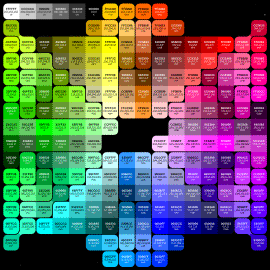
This one has this funky colour... Hexasticka? (It's not a wheel)
Apparently
image
looks like this for colourblind people
image

Cool things to keep in mind :)
Thanked by 1mattbenic

Comments

  • Interesting. Being color blind myself, what's the difference between those two palettes. I can tell you one thing though; it is quite a pain to distinguish the colours in some games. Especially (for me) where yellow and lime green intersects. Does the bottom palette reflect that?
  • It does, pretty much. Yellow is on the left of the top triangle, and lime green is at the top of the left triangle. In the bottom palette, they're both more or less the same shade of tan.
  • I recently reached out the devs of Kami to tell them how some of their levels are really hard for a colour blind person (aka me). Turns out the designer is red green colorblind as well, but it expresses differently from me and he did not have problems with those colours.

    Catering for colour blindness can be hard!
  • Tuism said:
    So the topic of colour blindness came up today again - my games tend to have colour blocks and colourblind people tend to not like them (@duncanbellsa sorry!)
    Haha it's not that I don't like them, it's just a barrier to entry. I remember thats partly the reason I stopped playing Call of Duty multiplayer. It's a huge problem for me because I can't distinguish whats right and whats wrong. It makes me doubt my actions and can get irritating when you make the wrong call.

    An easy way to describe it is the tonal values. For example, if you were to take it into photoshop and make it greyscale, the ones that are very close are more than likely the problem colours for me. A bright vibrant red would be easily distinguishable from a grass green. The problem comes in when the green is vibrant as well.

    As far as I know, I think my colour blindness is the most common. Not sure which one I have but it's mostly blue & purples, and reds & greens.


    colours.jpg
    871 x 642 - 23K
  • edited
    Yeah the easiest way to cater for colour blindness is to use tonal variances instead of colour variances - but the best way to go I guess is to make use of colours AND tone AND patter/design variances in concert, especially cos non-colourblind people are part of the audience too :P
  • Yes exactly! So the colours in your game are fine, it's just tweaking them to make them different enough :)
  • Yup. i.e. use a grassy/leafy green instead of lime green! :P

    Its actually surprising how many game developers are colour blind :)
    Thanked by 1duncanbellsa
  • farsicon said:
    Its actually surprising how many game developers are colour blind :)
    I'm a graphic designer by trade, kinda shot myself in the foot in terms of career choice :D

  • I am colour blind, but the 2nd image does look different to the first, it does group the colours that look the same at the top but they look different on the bottom image (sometimes lighter). I guess there are quite a few variations of colourblindness.
    One thing i usually struggle with is the red/green crossbar for enemies/allies. but quite a few games have a colourblind option which switches it with white (or yellow) and red. FTL is a great example of a colourblind friendly option, i remember playing on a friends PC and getting extremely confused until i realized what it was.
Sign In or Register to comment.