
So I decided to take the main character from my favourite video game. After a day of studying business I decided to yell FUCK IT IMA MAKE ME SOME CRAPPY PIXELS!!!!!
So in terms of reference


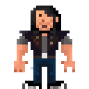
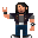
And the result (Which I almost don't want to post.)

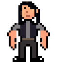
First iteration

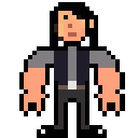
Second iteration

Third iteration

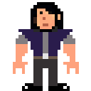
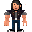
Fourth iteration

Fifth iteration

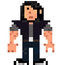
Sixth iteration


Seventh iteration

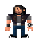
Eighth iteration

Ninth iteration

Tenth iteration

Eleventh iteration

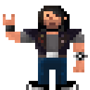
Twelfth iteration

Thirteenth iteration (will it never end, I don't want it to)


So in terms of reference
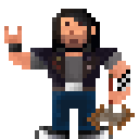
And the result (Which I almost don't want to post.)
First iteration
Second iteration
Third iteration
Fourth iteration
Fifth iteration
Sixth iteration
Seventh iteration
Eighth iteration
Ninth iteration
Tenth iteration
Eleventh iteration
Twelfth iteration
Thirteenth iteration (will it never end, I don't want it to)
Thanked by 1hanli
Comments
Suggestion - bigger, broader shoulders, smaller legs :) The dude looks like he has a top-heavier build (unlick Jack Black lol)
Get more consistent in your use of outline - some bits are broken. And then the one side of his head is more sloped than the other - the hair is fine, but the outline should remain the same both side cos he's not asymmetrical.
Cool start dude :)
I think the shoulders should carry the bulk rather than the bicep for pixel art. His pecs should also be bigger than his waist giving his upper body a bit of a V-shape and make him look top heavy like the reference pics
His hair should also go all around the back of his head, instead of just on the sides.
Otherwise looking good!
@Tachyon only the toe of the sneaker is really white. Maybe the sole as well, but I think the white right at the bottom would look rather weird.
I'm actually rather happy with this one! Also characters who wear just black is fucking hard :<
You could put a black outline around the bottom of the shoe to make it look like white sole?
Also, rather than the black outline you could even make the background a grey (or rather a dark red or something) to emphasise the other colours and show off the white soles too.
@Nandrew actually in terms of throwing horns it is in correct as the thumb is protruding. But for the art I want a thumb.
Try to use greys on the shoes instead of the black edges to get the sneaker white tip colour.
In terms of throwing horn, try lift his one arm up? :)
Will use more grey on the shoes in the next iteration.
I will eventually raise the arm, but baby steps here. No use to jump to using pointers before you understand arrays.
@retroFuture any tips, or links, on how I can do that? Improving the colouring (to accentuate the body and such) is really what I want to work on now before I head onto positioning the body.
And back to business. Thank the gods for pixel art. It's the only thing keeping me happy today.
But it's basically a RAM memory address you can pass around and stuff.
@RetroFuture...no need to get personal :P Thanks for linking the article. I will work through it and then try to work on my entry some more. :)
@Rigormortis please excuse retroFuture pseudo-hostile social interactions is his way of being friends.
@Tuism I thought the shoulder is the same size as the arm O_o could you elaborate on your point a bit for for the artistically retarded. Would really like to get this down before I start working on the pose and the axes.
Does that help?
@retroFuture What have you done?! I see banding everywhere now!
I like this spiky wrist band!
What would it look like if you didn't give him individual eyes and sorta just hinted at a brow-line, like the headbangers in the actual game have?
By wanting the shoulders to be wider I meant the actual rounded bits - the pointy bits you have actually look like shoulderpads from the 70s more than actual shoulders, or really big lapels for a cool suit. The grey bits are the shoulders.
The wrist strap is cool, but the one side si bigger than the other - should that be the case?
And in almost all cases of low-res art, the fist bends inwards not outwards, if that makes sense. Towards the body, by 1 pixel maybe.
Maybe make his pants a shade lighter to see that they're actually a different colour - right now they're very black-like.
Keep it up dude :) You're making good progress :)
@Denzil I have a progress of the character in the OP. So it's really not hard to do with the feedback. Everyone who has posted his been great many thanks to all the guys \,,/
@dislekcia I tried a no eye Eddie while editing. It wasn't good. Also the headbangers in Brütal have the no-eye/browline because they use their heads as weapons so they have a large protruding skull. Eddie has an Axe (to be drawn).
@Tuism you can see in the second reference that the spike-band on his left arm is longer than the wrist band on his right arm.
Also that is suppose to be a flat hand >.> While I am concerned that I didn't convey that correctly the stance and hands should be changing soon(ish)
It will also help break up the silhouette a bit :).
I am having far too much fun with this :3