College Of Pointy Hats

edited in Projects
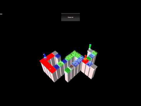
College of Point Hats is a game where you help 3 lost elemental wizards find their way home. Each wizard can only move on common tiles and can also move on the elemental tile his power is for. So earth on earth, fire on fire and so on. However once a wizard unlocks a tile others can pass over it or even stand on it and hold it unlocked for others. This puzzle mechanic is at the heart of the game. Figuring out how to solve each level by moving the characters between tiles.

image

Video


Playable Link
http://collegeofpointyhats.com/play/pointyhats.html

Downlaods
Windows Version
MAC Version

Target audience is Phone and Tablet users that enjoy puzzles games that center on color.
pointyhats_color_full_small.jpg
764 x 1080 - 184K

Comments

  • The new art looks pretty awesome! Cant wait to see where you guys take this.
  • Sounds like a awesome concept and has a lot of potential (I can't play the web build cause Linux). From watching the video, I have a few ideas:

    - Perhaps make it auto-select a wizard when there is only one on a cell (in the merged view). It seems like it's generally quite slow to select wizards and move them around.
    - It seems a number of cells can be linked together; perhaps it should be more clear which are linked?
    - Maybe zoom in a bit more? Would be nice to see some more of the character of the wizards.
    - Have you considered making the different colours more unique? I totally get a design goal of elegance, but perhaps some difference will make puzzles more interesting?
  • (I can't play the web build cause Linux).
    That is sad, didn't realize Unity web player was a windows only thing. Will include a PC/Mac and Linux build with the next release.
    - Perhaps make it auto-select a wizard when there is only one on a cell (in the merged view). It seems like it's generally quite slow to select wizards and move them around.
    This whole aspect is very much under consideration. We need the least intrusive solution that obvious to a player. The issue is if you click on that character meaning to move the one you have selected there versus clicking there to select that character. This is at the heart of the challenge.
    - It seems a number of cells can be linked together; perhaps it should be more clear which are linked?
    Yes absolutely, we currently considering a few ways. The columns could be similar for all the tiles that are linked or some kind of token on each. We will be looking at the possible solutions visually to see which one is strongest.
    - Maybe zoom in a bit more? Would be nice to see some more of the character of the wizards.
    Good suggestion. Needs to be a balance between seeing the wizards and the tiles. The current web build is of course the robots from the original game.
    - Have you considered making the different colours more unique? I totally get a design goal of elegance, but perhaps some difference will make puzzles more interesting?
    Well there visuals are set to change drastically. Water tiles the turn to ice etc. Do you mean the behavior more unique per tile?

    Thanks for the feedback @francoisvn was the mechanic easy enough to identify from the video?
  • @edg3 thanks glad you like the new visual style. @Tuism has joined us on this project and his art and thinking helping shape the final project.
  • Yeeeeah :D Very excited to be onboard with this! Super excited about the prospect of working out the interface surrounding the puzzle, it'll be a cool challenge and the outcome would be an awesome game :)

    Just glad I don't have to work out the puzzles cos I can't deal with that :P
  • Have you thought about touch based via pinching etc?
  • Interesting thought, as in? Pinch to pick up something and drop it somewhere else? Or pinch to zoom? The convention these days is pinch zoom. Dunno if pick up will work, it's still 3 characters in one space, and pinch is about the least precise of gestures.

    What were you thinking of?
  • Pinch to zoom and a two finger panning option could word well.
  • I've seen a few games try to do two finger panning when people only ever try to use one finger to pan, and it works very well for most games I've seen. I don't think a second finger is needed to pan :)
  • Why isn't there a UI element that allows me to select the character I want to be moving at the moment? Is there a specific reason that the UI has to be this constant pop-up?
  • edited
    @dislekcia we did have ui to choose. its a constant rushing back and forth between the button and the tile. We will add that back in for some play testing.

    @Tuism will build for touch and we can experiment.
  • @tbulford: It's only "rushing" if you're using a mouse. Touchscreens can have instant use between different areas of the screen, yay tapping... Also, keyboard shortcuts :)
    Thanked by 1tbulford
  • edited
    @dislekcia that's true on the touch devices. We have only been playing it on pc. For me in on my preference is the split screen. just click where you mean. Screens are big enough. Keyboard shortcuts are great can't be the only mechanism though.

    At the heart of the problem. Is knowing which one is selected when you make a choice. Been toying with options for that. everything going from.

    1. Scalling the selected toon up the others down.
    2. Some ui element showing the selected toon.
    3. circle under the selected toon in its respective color.
    4. Make the toons turn into the gems they carry unless they selected.
    5. A color overlay on the screen showing who is currently selected.
    6. An ambient sound that toon might make.

    I suspect we will end up with a combination of these ideas. and probably a different set for the touch or mouse devices.

    The split screen solves all these issues but reduces the screen space too much for mobile devices.
  • edited
    I also don't think the split screen works, it's not an elegant solution, and I think ends up confusing more than not. In the end the solution will probably be different between PC and touch.

    On PC it's probably reasonable to assume where you click is where you mean. Plus there is mousing over so the mouse cursor can indicate which of the three kids you're over so the player knows before they click which they're selecting. Then for the destination, the same. Click on the tile to move there, click on a character to select, clearly indicated by hover state. Well have to work out the tile/character ratio for an optimal solve. More advanced players can use keyboard shortcuts, and I do think three little portraits on screen indicating "unit selection" like in classic Syndicate is a good idea, also acts as a secondary selection mechanism. A clear element on one of the animals being selected is also important, like a circle under it or an arrow above their head or something.

    Then on touch, these are the different scenarios, with what I feel is the most expected outcome from a player perspective:
    1. Tap on a single animal with none selected: the player selects it.
    2. Tap on one or more animal while another is selected: contextual menu, select an animal there or move there.
    3. Tap on the ground while another is selected: move there, if possible. I think if the path there is drawn for the player to see clearly (or a broken path in he case of impossible to reach, also there should be feedback via audio or something indicating "I can't get there!") it'll be clear. (There might be a case made for deselecting the selected animal, but I think the expectation of action is stronger.)
    4. Tap on the animal already selected: deselect animal.

    I think the contextual menu doesn't always have to have all three options plus walk then grey out what's not there.
  • If I may offer a suggestion - do not allow multiple characters on the same tile - don't know if this was already considered, but it will allow for another dimension in the puzzles as well.
    Thanked by 2Tuism tbulford
  • I do like that, that does make the mechanic a lot cleaner, though I wonder how tough that'd be for puzzle making :P Probably doable, but hey I didn't make the puzzles so far XD
  • @Tuism I meant exactly what @tbulford said just below your question.
  • farsicon said:
    If I may offer a suggestion - do not allow multiple characters on the same tile - don't know if this was already considered, but it will allow for another dimension in the puzzles as well.
    This completely breaks the mechanic unfortunately. There are two distinct problems that we use to create puzzles that require the ability to stop on the same time. Essentially if comes down to only a specific element can activate a tile but once activated any character can step on that tile and then keep it activated. I think I will revisit this it would be cleaner.

  • An alternative for the split screen could also be that you draw out the path of each character (different color lines or something) up to the tile that is blocked - wondering if this will make it too easy though?
  • farsicon said:
    An alternative for the split screen could also be that you draw out the path of each character (different color lines or something) up to the tile that is blocked - wondering if this will make it too easy though?
    Essentially there are alternative paths and often you have to go backwards to be able to solve the puzzle not forwards. I am not sure how we could show the path as such.
  • I think what farsicon means is to like colour the blocks that each animal can get to to indicate all possibilities. Either only when the animal is selected or at all times. It's more a visual aid than a mechanics thing, and I do think it might make it too easy. Worth exploring.
  • Tuism said:
    I think what farsicon means is to like colour the blocks that each animal can get to to indicate all possibilities. Either only when the animal is selected or at all times. It's more a visual aid than a mechanics thing, and I do think it might make it too easy. Worth exploring.
    Oh that's on the cards for sure. I don't think it will be too easy its just a visual queue where you can or cant go. Almost like looking at the tiles through the eyes of that character they look different because they can go there.

  • I have been working on the game play design and two ideas that do not work separately work well together.

    This one
    farsicon said:
    If I may offer a suggestion - do not allow multiple characters on the same tile - don't know if this was already considered, but it will allow for another dimension in the puzzles as well.
    and the one where all the tiles that are linked directly together go solid when you step on them. These ideas alone break the system but together they give me the same solution and selecting characters is much easier. Only in the split view we might need to show where the other characters are or drop the split view altogether.

    Next build will work like this.
  • ********* New Build released links above.

    We had added windows and apple downloads as well as the web build.

    The main changes are.
    * All tiles in a row highlight when one is occupied.
    * The characters can not share a tile (this is something I am really happy to see since it was a real mess when they did).
    * The selection window is gone and replaced with simply clicking one tile then clicking where you want them to go.

    The last batch of feedback was great we looking forward to more.
  • Looks great, sounds brilliant, plays better! :D

    * I believe you mean all tiles "connected" are enabled when it's occupied?

    * Not sharing a single tile works great, but it's a bit weird that they can walk through one another but not stop on the same space. It can be solved thematically by the critters jumping over each other when they go through one another :)

    * Then the tiles "lighting up" - it feels like shiny = good, so it feels odd that you want to step onto shiny to remove bad things. So maybe make it something like a dark aura, something that feels bad, that your guys have to overcome. It's just a visual communication thing, but I was confused for a bit by it :)

    * I feel the three window thing is unnecessary, as it should be :P

    * I'm ambivalent about the three ending tiles thing, it feels off, thematically. Maybe all three tiles should be next to each other, and all three are under a gate? Or a single gate tile that they "go through" and disappear one at a time? Maybe have multiple goals as an extra mechanic further down the line, for the beginning, a single goal plays simpler and feels better, IMO.

    Awesome stuff :)
  • I think the default should be the split view. It makes it more puzzle like!
  • Fengol said:
    I think the default should be the split view. It makes it more puzzle like!
    Really? It feels like an unnecessary redundancy, as all the info can be seen in one screen. And it confused the **** out of me when I first saw the game in 3 views, really :)
  • then each level must start with one screen and then split into 3 as part of the opening animation. I actually found it easier to click on guys and move them around (although you can still end up selecting a character in one section that you didn't intend to. If I'm mousing around in the green section of the screen, clicking on any square should always be in context of the green character).
  • :) Thanks for the feedback. I think it would be ideal if the split view was not needed, however if its desired and makes the game better for some perhaps it should stay. I think we will have to wait for the final visualization before we can be sure.
    Tuism said:
    * Not sharing a single tile works great, but it's a bit weird that they can walk through one another but not stop on the same space. It can be solved thematically by the critters jumping over each other when they go through one another :)
    Yip been thinking of this would be great if it could be 6 different animations for each combination of who is jumping over whom.

    Sounds is still way behind where we want it to be. So is visual art style. Also regarding the endings we have something quit different in mind for the game. Will make sure to bring it into the next build. (At least in principle)
  • @tbulford: starting to come together nicely :) Another suggestion: how about not allowing characters to pass through each other at all - you can make it part of the puzzle that they need to finish in a certain order as well... maybe jumping can even be a trick that a character needs to earn/pick up/orchestrate in the game?
  • farsicon said:
    @tbulford: starting to come together nicely :)
    Thank you. We cant wait to get the modeled characters in.
    farsicon said:
    you can make it part of the puzzle that they need to finish in a certain order as well...
    That's in effect part of the puzzle already its just not forced with a mechanic but often the order is critical.
    farsicon said:
    maybe jumping can even be a trick that a character needs to earn/pick up/orchestrate in the game?
    I considered this my concern would be how much larger the levels would become.

    Thanks for the feedback
  • edited
    Some things I've noticed:

    * I agree with Tuism, the inaccessible tiles should be dark, while the tiles which will activate when you step on them should be the ones to glow! Instead of having inaccessible fire tiles be literally burning - which also creates visual clutter - they could perhaps be semi-corporial / darkened / transparent and when activated, they ignite and turn into a burning bridge of sorts?

    This is my biggest gripe with it at the moment, that the shiny inticing glowing tiles are actually inaccessible and useless, and the dull dark ones are actually what I want to look out for.

    * Following the debate between the different camera views, I vote for neither isometric nor split views. The isometric is clearly better than the split view, but it has the problem of making it difficult to distinguish what tile you are selecting - I keep wanting to click the robot above the tile and not on the base of the tile where I should be clicking. I feel you could solve this by making the view closer to a top-down viewpoint. Not completely top-down but a much higher camera angle. This will also reduce visual clutter when you have particles and other effects which overlap tiles behind them.

    * I dont like the way that all control is disabled when one of the characters is moving. I'm impatient and I want to select and move one robot while another is already busy traversing the level!

    * On my tiny laptop screen, the differentiation between a "push button" tile and a normal tile is not that clear. I feel that all red tiles should activate all other red tiles, always. This would streamline the gameplay, or maybe push buttons should only be introduced much later in the game.


  • edited
    Nitrogen said:
    * I agree with Tuism, the inaccessible tiles should be dark, while the tiles which will activate when you step on them should be the ones to glow! Instead of having inaccessible fire tiles be literally burning - which also creates visual clutter - they could perhaps be semi-corporial / darkened / transparent and when activated, they ignite and turn into a burning bridge of sorts?

    This is my biggest gripe with it at the moment, that the shiny inticing glowing tiles are actually inaccessible and useless, and the dull dark ones are actually what I want to look out for.
    The visualization is just representative, but one thing that's clear is we are going to need to show what we have in mind to folks before we put too much energy into building it. The ability to at a glance know whats going on and which toon can go where is central to the whole game.
    Nitrogen said:

    * Following the debate between the different camera views, I vote for neither isometric nor split views. The isometric is clearly better than the split view, but it has the problem of making it difficult to distinguish what tile you are selecting - I keep wanting to click the robot above the tile and not on the base of the tile where I should be clicking. I feel you could solve this by making the view closer to a top-down viewpoint. Not completely top-down but a much higher camera angle. This will also reduce visual clutter when you have particles and other effects which overlap tiles behind them.
    We will need to experiment with the different view. We have already rejected the idea of an outright top view. I think with he appropriate view and scaling the clicking on the character will be no different to clicking on the tile.
    Nitrogen said:

    * I dont like the way that all control is disabled when one of the characters is moving. I'm impatient and I want to select and move one robot while another is already busy traversing the level!
    The issue here is allowing two toons to move at the same time could break the puzzle. I guess we could queue movements. Especially if we show the path for the character.
    Nitrogen said:

    * On my tiny laptop screen, the differentiation between a "push button" tile and a normal tile is not that clear. I feel that all red tiles should activate all other red tiles, always. This would streamline the gameplay, or maybe push buttons should only be introduced much later in the game.
    One tile activating all others would completely break the puzzle mechanic it would be near imposable to build much of a puzzle like that. We might simply remove the buttons but create non transverse-able connections between sets of tiles. This is a visualization issue. There are sever ideas we have from glyphs to ant trails between the tiles. None feel very elegant just yet. Will give some though to simply creating ways to tell sets of colors apart then perhaps we could highlight all of a set irrespective of them been connected.

    Thanks for taking the time to evaluate it at this depth.
    Thanked by 1Nitrogen
  • edited
    tbulford said:
    We will need to experiment with the different view. We have already rejected the idea of an outright top view. I think with he appropriate view and scaling the clicking on the character will be no different to clicking on the tile.
    I knew of your aversion to top-down when I wrote that! So what I was suggesting was a compromise :P An angle similar to this:

    image

    You've pretty much covered all my other questions, so I'm keen to see the next version!

Sign In or Register to comment.