[Project] 6x Mass Production
Latest significant thread here! [edit: 2014-10-20]
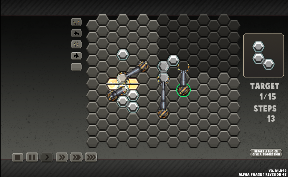
6x Mass Production (pronounced "6 fold mass production") is a puzzle game about instructing and constructing things. It is also the first game of raxterworks, an indie games company in the throes of creation.


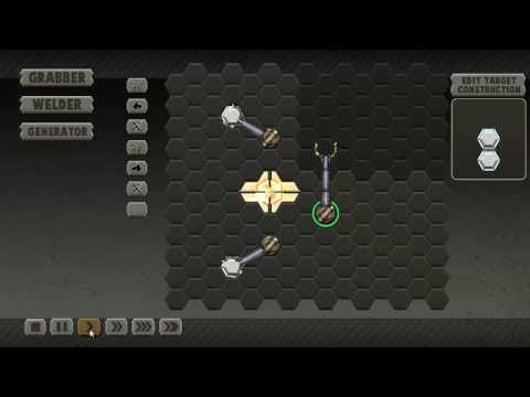
This is a slightly old vid but is more or less the same gameplay vibes. I'm stuggling to render the new one will replace when it's done. Check out the web-build
I demo'ed this last evening at the CT game meetup in one of the focused feedback slots. First off, thank you all for all the great feedback! It is all noted down and I'm swimming in ideas! For those who weren't there I focused on first time reaction and understanding of playing the game and how to make entering into what can be a dauntingly complex game easier.
In the meantime, please check out the webplayer build on my blog: http://raxterworks.blogspot.com/p/6x-mass-production-alpha-1.html
In its current state it's quite difficult to understand what to do (I thought it wasn't but the focused feedback session taught me otherwise). Your goal is to move, or in some cases construct and then move, parts into the darker finish area. There is a long list of things that will change, that I'll note below, but any further feedback is always appreciated!
So for anyone interested here is my messy trello board and I'll post a short plan of the future in a post after this (and a more detailed plan in a blog post later)
Sadly, I'm stopping dev on this for a month, and potentially longer as I might have client work to focus on. The month long dev freeze is since this was all done after hours and I'm simply about to burn out!
If you like it, leave a heart or a short "I liked it" or better yet some feedback! It means a lot to me that people are enjoying the game. There'll be a lot of overlap from yesterday's feedback session I'm sure (since there are obvious glaring problems with the initial levels that I won't be able to fix for a while) but the more perspectives the better!
Stay chilled and groovy, all B-)
6x Mass Production (pronounced "6 fold mass production") is a puzzle game about instructing and constructing things. It is also the first game of raxterworks, an indie games company in the throes of creation.


This is a slightly old vid but is more or less the same gameplay vibes. I'm stuggling to render the new one will replace when it's done. Check out the web-build
I demo'ed this last evening at the CT game meetup in one of the focused feedback slots. First off, thank you all for all the great feedback! It is all noted down and I'm swimming in ideas! For those who weren't there I focused on first time reaction and understanding of playing the game and how to make entering into what can be a dauntingly complex game easier.
In the meantime, please check out the webplayer build on my blog: http://raxterworks.blogspot.com/p/6x-mass-production-alpha-1.html
In its current state it's quite difficult to understand what to do (I thought it wasn't but the focused feedback session taught me otherwise). Your goal is to move, or in some cases construct and then move, parts into the darker finish area. There is a long list of things that will change, that I'll note below, but any further feedback is always appreciated!
So for anyone interested here is my messy trello board and I'll post a short plan of the future in a post after this (and a more detailed plan in a blog post later)
Sadly, I'm stopping dev on this for a month, and potentially longer as I might have client work to focus on. The month long dev freeze is since this was all done after hours and I'm simply about to burn out!
If you like it, leave a heart or a short "I liked it" or better yet some feedback! It means a lot to me that people are enjoying the game. There'll be a lot of overlap from yesterday's feedback session I'm sure (since there are obvious glaring problems with the initial levels that I won't be able to fix for a while) but the more perspectives the better!
Stay chilled and groovy, all B-)

Comments
Alpha Phase 1 - Core
- Core mechanics (grabber, welder, splitter)
- 2-6 parts
- basic sound and music
- Solid game interface <-- psst this is where you wonderful people gave me help at the meetup :D
- Rework the positioning of the instruction list and play/pause/fast-forward buttons to make more sense, potentially make both horizontal or vertical to unify their purpose a bit
- Better use of colours to indicate different UI interactions
- Clarify what the finish zone is (make artwork less abstract, add factory floor props to give contex)
- Multiple channels for multiple grabbers
- Numbered instructions
[*] Functional level editor with import/export[list]
[*] Basic menu system
[/list]
Alpha Phase 2 - Depth
- Solid tutorial/help UI <-- psst this is also where you wonderful people gave me help at the meetup :D
- Some of these mix with the phase 1 "solid game interface" task
- Step by step hand hold style tutorial (call to action clearly shown at each step)
- Smaller grid for initial levels
- Popups/tooltips for ... like everything
- Gamifying commands, i.e. each tutorial level introduces a command explicitly
[*] Expanding the core grabber types (different types with limited instruction sets)[list]
- One would only be bale to turn and grab, other rotate and grab, eventually once player is comfortable with these they will be unified into the super grabber (i.e. the current full instruction set grabber)
[*] Fully functional/finished level editor[*] Profiles
[/list]
Alpha Phase 3 - Aesthetics
- CONTENT!
- Many parts with different looks
- Soundtrack and sound effects
- Multiple soundtrack (like 2 or 3 at least)
- Visually appealing menu system
- Special Effects and juice
Beta- Bug fixing and polish
Release- Drinks on me
So I'm approaching phase 2 of the plan... somewhat. Ok phase 1 is nowhere near to finished ("solid game interface" needs a lot of work)Mind you, this is not an assumption that this'll go the distance (and, man do I want it to) but it won't go the distance without a plan.
Let me know if I've missed anything that you think you mentioned at the meetup. I think I got most of it down
I like the idea, there is a lot of potential for different levels. People said this during the meetup, I just want to give my view of it. In the beginning, be very clear what the player has to do. In the first level, the whole aim of the game was in the top right, and that message was competing for attention with all the other messages.
The basic goal is quite simple, get pieces into the goal. This should be very easy to communicate to the player. Make it the first thing you communicate and then move from there.
Otherwise it's a really cool game, lot's of potential :)
@dislekcia Yes! Again, well articulated. I shall make a special note of this. I've also not forgotten and all the other comments made way back when. Thanks again!
[p.s: I did add lighting effects and sparks to the welder and splitter which is half working in the web build (dafuc web build? ... probably sometihng I broke >.< ) and I'm trying/struggling to upload an updated vid that shows it off]
I quite like the honeycomb grid and think you should stick with that look and develop your art style around that. I can see myself playing this game for hours.
All the more reasons I'm loving the feedback!
The artist working on it has like 1.5 full times jobs at the moment so hopefully we'll be able to meet in a month when I start looking at it again. He did all the artwork from concept to completion in like 5 days with no time to plan so I know he wants to take it further too!
This is stuff you probably already know, but I'll just give my two centirands:
-The command queue element wasn't really discernable from the grid initially (since it uses the same tile sprite), and there was a lack of immediate clarity on how to interact with it. Perhaps having the queue colour-matched to its corresponding arm will help?
Knowing how to rearranging, inject and cancel commands would be nice to know right off the bat, rather than after a few tutorials where I was doing the wrong thing. Selecting the commands themselves is quite clear and easy though, and the icons make sense, but I'd advocate descriptive tooltips as well. Other than that it was pretty clear and intuitive once I wrapped my head around it.
The time controls are a good idea, but unless you can make watching the arms cycle more visually interesting, I'd just set the objective count lower instead. Why have a 15 unit objective when 8 will do as a proof of system?
I can't wait to see more of this. Great work!
@Gazza_N so glad you like it! One man's centirands are another man's treasure :p Have taken note of your comments, many thanks.
A lot of UI design stuff, I've discovered, has gone well over my head! Many things like you use this shape and this colour in two places but they have different contexts. Really appreciate that sort of feedback, it's where I am (clearly) not experienced... wow such learn much XP so design
The target number used to be 10, I made it 15 as there are (rare) occasions that you could have a non perfect loop that will only crash after 11 or 12 instructions (literally this manifests because you have 12 instructions per grabber) ... a lot of people have said what you've said though, so I might bring it back to a nice round 10 (tho for a programmer, 8 is a nice round number :p). I mean it makes sense that if the player is off by one 'wait' instruction they shouldn't be punished, "it's close enough, you got the idea well done! carry on with more fun puzzles!"
Hi everyone.... this is an ooold post, and it's been a long long time since I've made any official word on the project. People have been asking me what's up with it though
Instead of making a new topic I thought I'd necro this one with a comment (which turned it into a blog post ) since it's still the same game.
TL;DR SCROLL TO THE BOTTOM OF COMMENT AND LOOK AT PRETTY
So I recently tried out the new Unity 4.6 beta. That's actually an understatement since I'm now using it fulltime for development of 6x Mass Production (restarted everything... for reasons... just trust me on this one)
It's really good! If anyone knows or has used NGUI they'll know just how complete a UI system that is. They also might know that the main developer behind NGUI was involved in development of the Unity GUI system, and it shows! The coding and component style is very similar! I've decided to switch to UGUI completely now as a result. Slight risk on my part since Unity 4.6 might be in beta for a while but 6x Mass Production is going to be in beta for a while so I'm going to run with it.
But! The reason I post here now it to show off something cool that was far easier in UGUI than NGUI. Shader tricks! Well, at least this shader trick!
So there are no 3D elements in the game, just 2D elements, a shader, one directional light and some point lights. This is nothing new, but I'm so stoked that this worked out so well that I wanted to share what I did. I did briefly try to get this working with the Unity 2D sprite component... when I say briefly I mean 10 minutes, didn't quite get it but I'm sure it's possible too!
Also note that I might be butchering terminology, leave a comment if anything bugs you in this regard ^_^
Anyway, for UGUI:
Step 1: You'll need your texture and a bump map
So this texture is already shaded, the artist didn't know I'd be using dynamic lights
5 minutes to hack this up in Photoshop
You'll want to make sure that the normal map is setup correctly:
The important part is to turn on the "Create from Grayscale" option. If you don't know, basically the "Create from Grayscale" option turns the grey heightmap into a normal map
Step 2: Create the custom shader. This following code is exactly the same as the standard Unity Diffuse Sprite shader, besides 3 lines
Shader "Custom/Sprites/Bumped"
{
	Properties
	{
		[PerRendererData] _MainTex ("Sprite Texture", 2D) = "white" {}
		_BumpMap ("Normalmap", 2D) = "bump" {} // *********** THIS LINE IS NEW ***********
		_Color ("Tint", Color) = (1,1,1,1)
		[MaterialToggle] PixelSnap ("Pixel snap", Float) = 0
	}

	SubShader
	{
		Tags
		{
			"Queue"="Transparent"
			"IgnoreProjector"="True"
			"RenderType"="Transparent"
			"PreviewType"="Plane"
			"CanUseSpriteAtlas"="True"
		}

		Cull Off
		Lighting Off
		ZWrite Off
		Fog { Mode Off }
		Blend One OneMinusSrcAlpha

		CGPROGRAM
		#pragma surface surf Lambert vertex:vert
		#pragma multi_compile DUMMY PIXELSNAP_ON

		sampler2D _MainTex;
		sampler2D _BumpMap; // *********** THIS LINE IS NEW ***********
		fixed4 _Color;

		struct Input
		{
			float2 uv_MainTex;
			float2 uv_BumpMap;
			fixed4 color;
		};

		void vert (inout appdata_full v, out Input o)
		{
			#if defined(PIXELSNAP_ON) && !defined(SHADER_API_FLASH)
			v.vertex = UnityPixelSnap (v.vertex);
			#endif
			v.normal = float3(0,0,-1);

			UNITY_INITIALIZE_OUTPUT(Input, o);
			o.color = v.color * _Color;
		}

		void surf (Input IN, inout SurfaceOutput o)
		{
			fixed4 c = tex2D(_MainTex, IN.uv_MainTex) * IN.color;
			o.Albedo = c.rgb * c.a;
			o.Alpha = c.a;
			o.Normal = UnpackNormal(tex2D(_BumpMap, IN.uv_BumpMap)); // ******** THIS LINE IS NEW ********
		}
		ENDCG
	}

Fallback "Transparent/VertexLit"
}
Step 3: Create a bump map material with your normal/bump map
You'll see that I use "Custom/Sprites/Bumped" this is the shader I pasted above
Step 4: Create a Unity Image component with your image and custom bump map material
Step 5: Add lights, add more sprites make them do things and BOOM!
Ok, so this isn't an all encompassing tutorial or anything but I thought I'd share because I thought it looked cool and really wasn't too much effort to set up! There are some issues that might need addressing:
- Since we are using lights we are now constrained by the limitations that the light system imposes on us. So only a limited number of point lights (the default is 4 but you can set the number in the Unity quality settings)
- Extra draw calls! A direct result of using more lights means that more draw calls are needed to draw each light's contribution. This is usually fine for standalone but I suspect mobile might struggle a bit.
- If you are working from a sprite sheet and using unity to cut it up this method might not be workable. At least if it is I've not tried to make it work. Crux of the matter is that Unity's sprite atlasing parts and the normal mapping texture parts don't integrate nicely right now. Only tried for liek 10 minutes to get it to work so maybe someone has a smart solution out there. With NGUI I was able to map a normal map sheet to the image sheet with a similar shader, wonder if there's something similar I can do with UGUI...
That said, look at this shit! No 3D elements and it's looking pretty cool... well I think so anyway!Oh, on another note! Keep an eye out, I'll have a playable version of 6x Mass Production for people to play soon, light effects and all! I should be working on the level design but I kinda meandered along this interesting light effect, game seems lifeless without it now :p