[Competition] A: Judging! Dum Dum Duuuum!

After many months of reviewing the entries for "Competition A", myself and Bevis (along with some input from Filip Orekhov of Tasty Poison) have finished the judging, and here are the results!
We have tried to offer some criticism and praise for each of the images submitted. We have chosen a top 3, a most improved, coolest concept and most imminently usable. Hopefully this feedback will inspire entrants to challenge themselves with pixel art experiments/games in the future, and/or provide some practical advice for improvement. We apologize in advanced if any of the feedback seems rushed, we only had two months to put this together.
_____________________________________________________________________________________________________________________

Entrant 1: Zeratul by @Leorica
The strengths of this image, in that it is easily recognizable and faithfully rendered, are also its weaknesses. It looks very much like a well rendered image of Zeratul that has been shrunk down to 64 X 64. This would have worked far better at a larger size.
_____________________________________________________________________________________________________________________
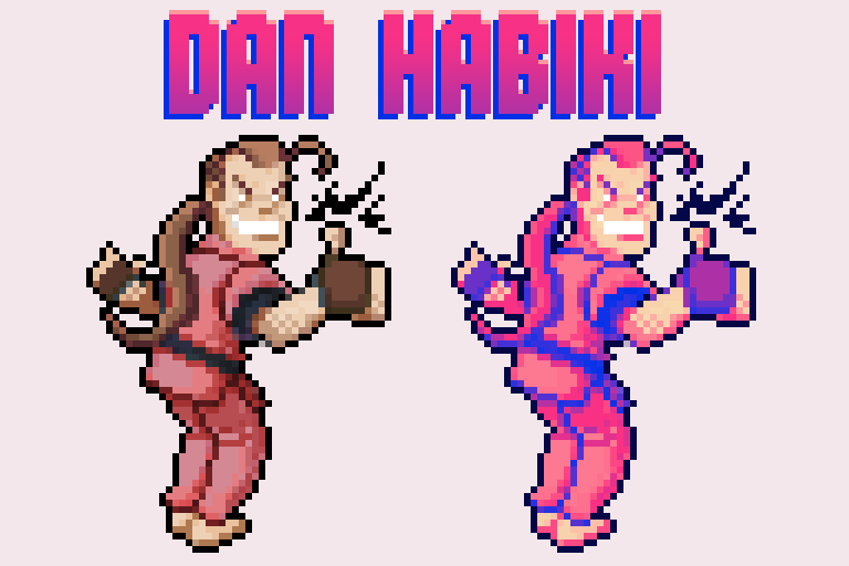
Entrant 2: Dan Habiki by @Pomb
What we liked about this is that it captured and accentuated the characteristics of the original Street Fighter character, as well as having been rendered in a very readable way. This image would work brilliantly in a Street Fighter demake.
_____________________________________________________________________________________________________________________

Entrant 3: Sven by @Pomb
Again this is a nice caricature of the original game character, but the rendering is a lot messier than in Dan Habiki. The use of dithering is not consistent, and in places the shading looks like the image has been skewed or resized (like on the sword). The saturation of the colours are a bit random, but on the whole it is still a very cool image.
_____________________________________________________________________________________________________________________

Entrant 4: Altair by @Bensonance
Saving the image as a jpg didn't help with the noisiness. Because there are so many layers of cloth on the character having some lighting/shadowing would have helped define the form better, but the character does have a good silhouette, tastefully chosen details and is easily identifiable. Very good for a first attempt!
_____________________________________________________________________________________________________________________

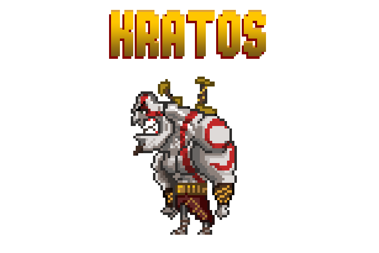
Entrant 5: Kratos by @TasticLuc
A very cool caricature of Kratos which accentuates his head and upper body and makes him look comically villainous. The line work is strong, but a bit lazily rendered in places and could have used a second pass to better define the forms. The shading is also very well executed but has an ambiguous light-source. A little extra love and this would have been awesome.
_____________________________________________________________________________________________________________________

Entrant 6: Cloud by @edg3
We liked that the sword is so big, because it makes this very easily identifiable as Cloud. The weighting of his pose has been lost from the original source, and his spiky isn't really conveying here.
_____________________________________________________________________________________________________________________

Entrant 7: Rat Ogre by @Rigormortis
This image could have been at a smaller resolution, there is a lack of detail as it stands. While this work went through a few phases and improvements, some of the changes weren't for the best, like losing the shading above the eye and suggestions of fur. The final product looks oddly clean for a Warhammer character. But the attempt to learn and improve is commendable.
_____________________________________________________________________________________________________________________

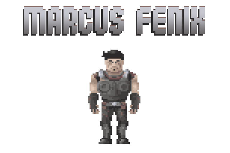
Entrant 8: Marcus Fenix by @duncanbellsa
The colours chosen here convey the grey/browness of Gears of War brilliantly. This image looks very lovingly rendered, the metal really looks like metal. The head isn't as recognizable or iconic as it could be.
_____________________________________________________________________________________________________________________

Entrant 9: Kha'zix by @skinklizzard
Some of the forms get lost in the near universal purple tones, the image needs more contrast. The rendering looks a bit crunchy, but the character very recognizable and the sense of perspective is strong.
_____________________________________________________________________________________________________________________

Entrant 10: Companion cube - @notsimon207
This looks like a companion cube.

Entrant 11: Gordon Freeman by @LittleBear
The silhouette makes him look like a robot. The colours are rich and appropriate, and the rendering is nice and clean, but the proportions are kind of off.
_____________________________________________________________________________________________________________________

Entrant 13: The Quest For Glory Dude - @Nandrew
This looks like a very affordable art style. This could work really well in a turn-based fantasy puzzle rogue-like.
_____________________________________________________________________________________________________________________

Entrant 12: Necron Warrior by @D3zmodos
This is cute and charming and very obviously a Necron Warrior. Again, it looks easy to animate and work with. The black lines could have been a little less generous.
_____________________________________________________________________________________________________________________

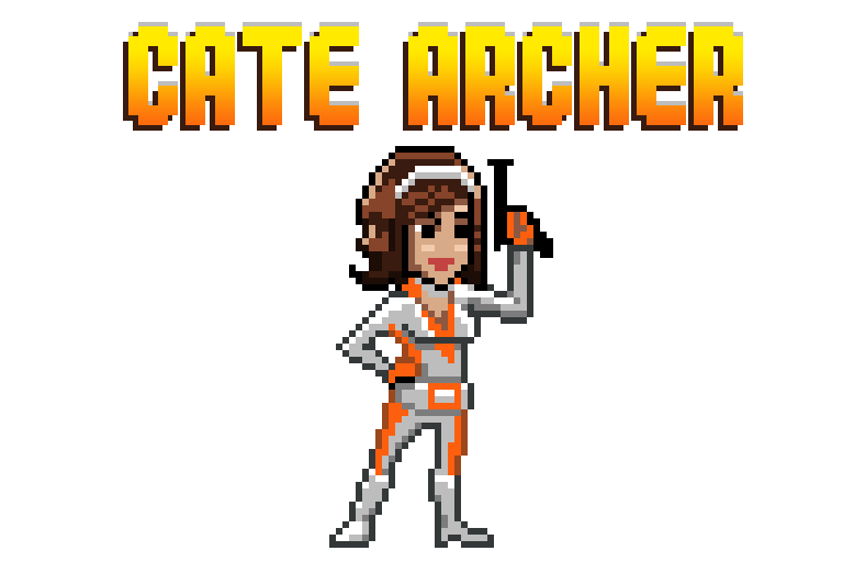
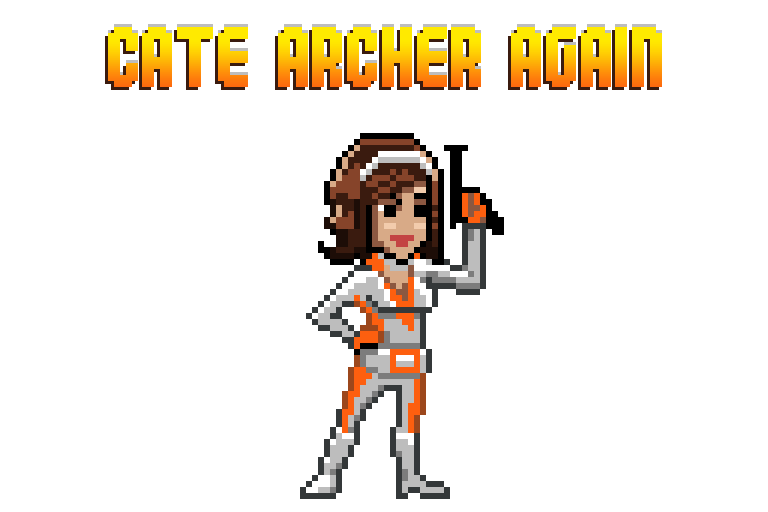
Entrant 13: Cate Archer by @Elyaradine
This is a very charming chibi rendering of Cate Archer. Elyaradine clearly understands pixel art and it's limitations and the resulting work looks like it could be put straight into a game. The shading is good, but the outlines aren't 100% consistent (giving her a mono-boob).
_____________________________________________________________________________________________________________________

Entrant 14: Limbo by @Kelga
The resizing down really crushed the quality on this submission. It looks very easy to use and animate, looks charmingly simple, and is very obviously the limbo boy.
_____________________________________________________________________________________________________________________

Entrant 15: Jade by @damousey
This captures the character of the game, and is well silhouetted and posed, but there are a few odd technical problems with it (some of which weren't apparent at first but were introduced during the process). Her pants in particular are kind of blurry and her facial features are hard to make out with all the different colours used in her face. The outlines are a little inconsistent, but on the whole she is very appealing.
_____________________________________________________________________________________________________________________

Entrant 16: Eddie Riggs by @Karuji
This is a nice attempt and we can see a lot of improvement. His clown shoes are a little worrying.
_____________________________________________________________________________________________________________________

Entrant 17: Gordon Freeman by @aodendaal
The pose is a little awkward. He seems to be standing on one leg about to fall over more than he seems to be walking. The colours chosen for his glasses make them hard to identify, but otherwise his head is quite nicely stylized. It is clearly Gordan Freeman and his trusty crow-bar.
_____________________________________________________________________________________________________________________

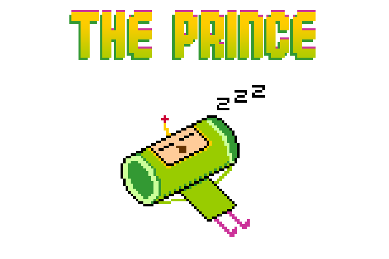
Entrant 18 : Katamari - The prince - @Ally
This is a very charming depiction of the Katamari character. The simplification of forms is very effective here. It looks very easy to use and animate in a game.
_____________________________________________________________________________________________________________________

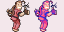
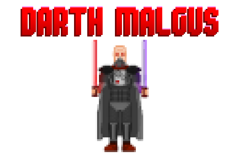
Entrant 19: Star Wars the old republic by @Actrox
Illustrating this huge and resizing it down was not a good idea. The final image lost a lot of its definition, like the white glowing centres of the light sabres and the deep reds of his eyes. That said we can see a huge improvement from where this concept began and Atrox seems to have learnt a lot through the criticisms the community offered and his own experiments.
_____________________________________________________________________________________________________________________
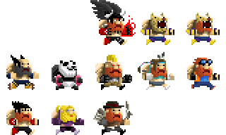
Entrant 20: Tekken dudes by @Tuism
Lots and lots of cool ideas and inspiration. The shear amount of beard included is commendable. These don't actually depict the characters from the Tekken games, but are really dwarves themed as Tekken characters. We would love to play Angry Dwarven Street Battle when it comes out.
_____________________________________________________________________________________________________________________
And the judging is as follows!
ATROX!
CATE ARCHER!
CATE ARCHER! (again)
KATAMARI!
MARCUS FENIX!
KRATOS!
CATE ARCHER!
DAN HABIKI!
We have tried to offer some criticism and praise for each of the images submitted. We have chosen a top 3, a most improved, coolest concept and most imminently usable. Hopefully this feedback will inspire entrants to challenge themselves with pixel art experiments/games in the future, and/or provide some practical advice for improvement. We apologize in advanced if any of the feedback seems rushed, we only had two months to put this together.
_____________________________________________________________________________________________________________________
Entrant 1: Zeratul by @Leorica
The strengths of this image, in that it is easily recognizable and faithfully rendered, are also its weaknesses. It looks very much like a well rendered image of Zeratul that has been shrunk down to 64 X 64. This would have worked far better at a larger size.
_____________________________________________________________________________________________________________________
Entrant 2: Dan Habiki by @Pomb
What we liked about this is that it captured and accentuated the characteristics of the original Street Fighter character, as well as having been rendered in a very readable way. This image would work brilliantly in a Street Fighter demake.
_____________________________________________________________________________________________________________________
Entrant 3: Sven by @Pomb
Again this is a nice caricature of the original game character, but the rendering is a lot messier than in Dan Habiki. The use of dithering is not consistent, and in places the shading looks like the image has been skewed or resized (like on the sword). The saturation of the colours are a bit random, but on the whole it is still a very cool image.
_____________________________________________________________________________________________________________________
Entrant 4: Altair by @Bensonance
Saving the image as a jpg didn't help with the noisiness. Because there are so many layers of cloth on the character having some lighting/shadowing would have helped define the form better, but the character does have a good silhouette, tastefully chosen details and is easily identifiable. Very good for a first attempt!
_____________________________________________________________________________________________________________________
Entrant 5: Kratos by @TasticLuc
A very cool caricature of Kratos which accentuates his head and upper body and makes him look comically villainous. The line work is strong, but a bit lazily rendered in places and could have used a second pass to better define the forms. The shading is also very well executed but has an ambiguous light-source. A little extra love and this would have been awesome.
_____________________________________________________________________________________________________________________
Entrant 6: Cloud by @edg3
We liked that the sword is so big, because it makes this very easily identifiable as Cloud. The weighting of his pose has been lost from the original source, and his spiky isn't really conveying here.
_____________________________________________________________________________________________________________________
Entrant 7: Rat Ogre by @Rigormortis
This image could have been at a smaller resolution, there is a lack of detail as it stands. While this work went through a few phases and improvements, some of the changes weren't for the best, like losing the shading above the eye and suggestions of fur. The final product looks oddly clean for a Warhammer character. But the attempt to learn and improve is commendable.
_____________________________________________________________________________________________________________________
Entrant 8: Marcus Fenix by @duncanbellsa
The colours chosen here convey the grey/browness of Gears of War brilliantly. This image looks very lovingly rendered, the metal really looks like metal. The head isn't as recognizable or iconic as it could be.
_____________________________________________________________________________________________________________________
Entrant 9: Kha'zix by @skinklizzard
Some of the forms get lost in the near universal purple tones, the image needs more contrast. The rendering looks a bit crunchy, but the character very recognizable and the sense of perspective is strong.
_____________________________________________________________________________________________________________________
Entrant 10: Companion cube - @notsimon207
This looks like a companion cube.
Entrant 11: Gordon Freeman by @LittleBear
The silhouette makes him look like a robot. The colours are rich and appropriate, and the rendering is nice and clean, but the proportions are kind of off.
_____________________________________________________________________________________________________________________
Entrant 13: The Quest For Glory Dude - @Nandrew
This looks like a very affordable art style. This could work really well in a turn-based fantasy puzzle rogue-like.
_____________________________________________________________________________________________________________________
Entrant 12: Necron Warrior by @D3zmodos
This is cute and charming and very obviously a Necron Warrior. Again, it looks easy to animate and work with. The black lines could have been a little less generous.
_____________________________________________________________________________________________________________________
Entrant 13: Cate Archer by @Elyaradine
This is a very charming chibi rendering of Cate Archer. Elyaradine clearly understands pixel art and it's limitations and the resulting work looks like it could be put straight into a game. The shading is good, but the outlines aren't 100% consistent (giving her a mono-boob).
_____________________________________________________________________________________________________________________
Entrant 14: Limbo by @Kelga
The resizing down really crushed the quality on this submission. It looks very easy to use and animate, looks charmingly simple, and is very obviously the limbo boy.
_____________________________________________________________________________________________________________________
Entrant 15: Jade by @damousey
This captures the character of the game, and is well silhouetted and posed, but there are a few odd technical problems with it (some of which weren't apparent at first but were introduced during the process). Her pants in particular are kind of blurry and her facial features are hard to make out with all the different colours used in her face. The outlines are a little inconsistent, but on the whole she is very appealing.
_____________________________________________________________________________________________________________________
Entrant 16: Eddie Riggs by @Karuji
This is a nice attempt and we can see a lot of improvement. His clown shoes are a little worrying.
_____________________________________________________________________________________________________________________
Entrant 17: Gordon Freeman by @aodendaal
The pose is a little awkward. He seems to be standing on one leg about to fall over more than he seems to be walking. The colours chosen for his glasses make them hard to identify, but otherwise his head is quite nicely stylized. It is clearly Gordan Freeman and his trusty crow-bar.
_____________________________________________________________________________________________________________________
Entrant 18 : Katamari - The prince - @Ally
This is a very charming depiction of the Katamari character. The simplification of forms is very effective here. It looks very easy to use and animate in a game.
_____________________________________________________________________________________________________________________
Entrant 19: Star Wars the old republic by @Actrox
Illustrating this huge and resizing it down was not a good idea. The final image lost a lot of its definition, like the white glowing centres of the light sabres and the deep reds of his eyes. That said we can see a huge improvement from where this concept began and Atrox seems to have learnt a lot through the criticisms the community offered and his own experiments.
_____________________________________________________________________________________________________________________
Entrant 20: Tekken dudes by @Tuism
Lots and lots of cool ideas and inspiration. The shear amount of beard included is commendable. These don't actually depict the characters from the Tekken games, but are really dwarves themed as Tekken characters. We would love to play Angry Dwarven Street Battle when it comes out.
_____________________________________________________________________________________________________________________
And the judging is as follows!
ATROX!
CATE ARCHER!
CATE ARCHER! (again)
KATAMARI!
MARCUS FENIX!
KRATOS!
CATE ARCHER!
DAN HABIKI!
Comments
Congrats to the winners.
P.S. that intermission .gif ........... reminds me of Fight club and disney movies...don't know why ;)
I give this competition post 8.5/10. Could use some compatibility work for smaller screens.