How to make low poly look good in Unity
Hello guys,
The game we are busy working on is low poly (also due to being for mobile) so I want to find out if it is possible to make our game look as good as the low poly games listed below in Unity FREE version and how.
I am mostly concerned about the lighting and the shading of the models and the environment.
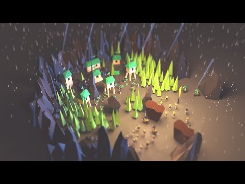
QuickHunt
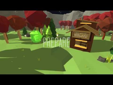
A sample Unity project
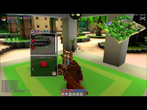
Cube World
Any help would be greatly appreciated
The game we are busy working on is low poly (also due to being for mobile) so I want to find out if it is possible to make our game look as good as the low poly games listed below in Unity FREE version and how.
I am mostly concerned about the lighting and the shading of the models and the environment.
QuickHunt

A sample Unity project

Cube World

Any help would be greatly appreciated

Comments
For Unity free you don't have the luxury of post-processing effects, so I suggest learning all you can about baking lightmaps into the environment.
BUT: to actually be helpful, there has ALWAYS been an answer to making low poly look good: good textures, a fine unlit texture goes a long way, and a subtle lighting system only compliments it. in this case, from what I see of the look you may be attempting to attain: a solid colour texture, or in some cases a gradient to make that fake lighting, in combination of a baked on ambient occlusion layer to make fake shadows, this makes the texture do all the work in the rendering and not a grindy lighting system.
so, IT IS POSSIBLE, just need your art team to fidget and experiment to see what works.
This is all from a painter's observation so it's missing the technical aspects that would make it a solution. Sorry
in the above examples;
Cubeworld uses Ambient Occlusion, so it has a gradient shadow, but instead of that gradient being colour-> 'blacker version of that colour' it is colour-> 'more saturated and warmer version of that colour' ->'blacker version of that colour' it's probably using a shader with a blend mode or equivalent.
Quickhunt uses a colour scheme in which every colour is a warm version of that colour, even the grey in the bg is a warm and yellow grey. It leans on a light=yellow/shade=purpleish scheme, a classic. In addition it uses a single 'difference' for its shadows that is very controlled, this allows them a little more freedom to add more colour to their light; with fewer samples for the audience to interpret, fewer 'false colour' flags trigger, and they're more likely to assume light and shade colours are true and not see it as a yellow stage light dominating where the missing 'saturated version of colour' should be.
the Low Poly demo uses the same approach of a coloured ambient light, even in the more neutrally lit scene at 3:00 you can see the white of the buildings is cream to pink on one side and blueish on the shadow side, not grey, if you look at 1:55 you'll see that even during a vivid blue lighting strike, the tops of those flat rocks remain orange/ warm in accordance to the ambient light.That's the darkest object in the scene (less luminosity means less space for saturation) being both distinctly orange-red and blue simultaneously. This example also has ambient occlusion but it doesn't strip the saturation from the scheme.Look at 2:55, the stilt for the yellow house and the front facing side of blue house both descend from the neutral yellow local light to a reddish tone behind objects. Many little local lights also adds to this demo's charm by reinforcing the diorama feel.
TLDR: Choose a good colour scheme and don't let grey in.
it's good artists that make art look good.
i.e. No matter what tech you use, if you're not wielding your tech and tools with an artful eye, you're not going to get beautiful results.
Having said that, what sort of technical tricks you can do to give your artists more freedom to create their vision is somewhat dependent on your game, and on your artists' technical knowledge. The examples you link seem to be extremely light on textures -- I'd argue that the look is less about being "lowpoly" and more about being "low/no textures". It's a huge production advantage not to have to worry about UVs, texel resolution and texture memory.
So I'd consider looking at your art assets and how you'd feel about their not having textures at all. I'd also strongly consider lightmaps, if you're not already using them. (And if Unity Free gimps your lightmap baking, you can bake them in an external application where you can get fancy, lay out your lightmap UVs yourself, and read the new lightmap yourself.) And I'd investigate using either vertex colours, or shaders that blend between (at least) two colours based on something to do with normal or light direction. If your geometry is super lowpoly, you're on the low end in draw calls, and your game has a good reason for using them, you might also investigate realtime shadows (but they won't work on all mobile devices).
There are 2 things that I need to ask regarding the info you guys have given me as I do not have as much exposure in the 3d art scene.
1- What is the best way to do the ambient occlusion in Blender for the texture (I am fine with having plain colors instead of detailed textures)
2- Is there a place where I can either learn or get a generated pallet of colors that will fit together nicely?
Please show us before and after screenshots so we can help more and see the effects of the feedback. I'm actually super curious now. Or maybe I just like a forum with more pictureness.