-
Unity 5!
YES! Now I'm back to being tentatively hopeful about the new Unity GUI!Angry Moose said:They don't. He left back in November: http://forum.unity3d.com/threads/223311-NGUI-developer-leaves-Unity-New-GUIUnity 5!
They don't. He left back in November: http://forum.unity3d.com/threads/223311-NGUI-developer-leaves-Unity-New-GUITheFuntastic;21010" said:Been doing UI for the last couple of weeks. Even with NGUI getting things pixel perfect is a steaming pile of horse bollocks. I sincerely hope the fact they've ... got the NGUI guy in means it's actually up to snuff.Nick Cuthbert's Art PortfolioHi. My name is Nick Cuthbert, and I'm an Electrical and Computer Engineering Student at UCT. This is my art portfolio. Most of it is literally that, art, but there are a few transactional pieces and game assets hidden amongst the high res raster glory.
VU
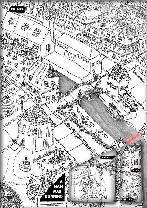
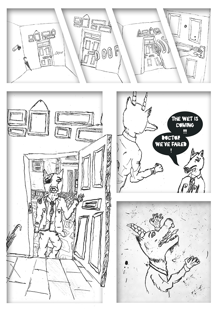
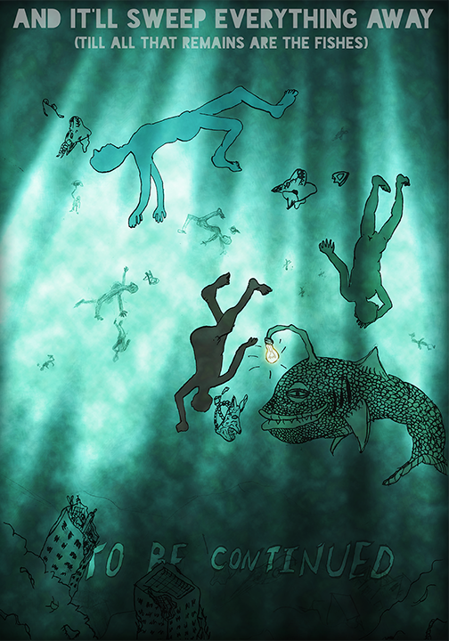
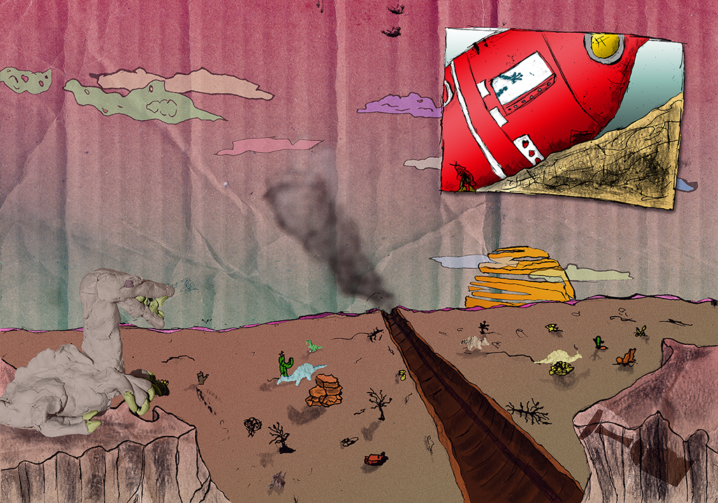
Some samples of a short graphic adventure made concerning global warming.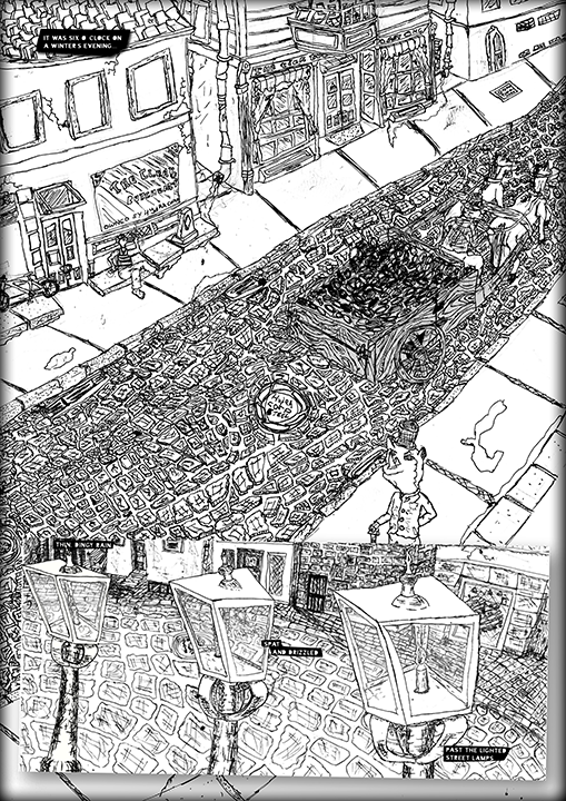
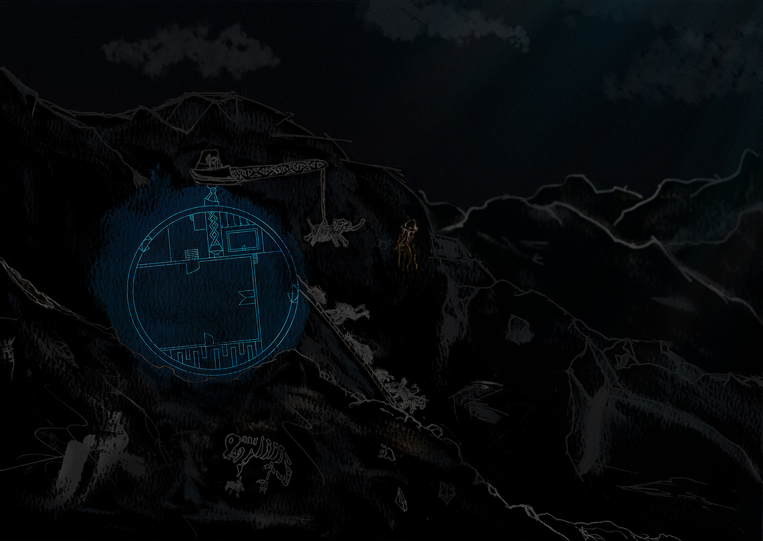
Arc.1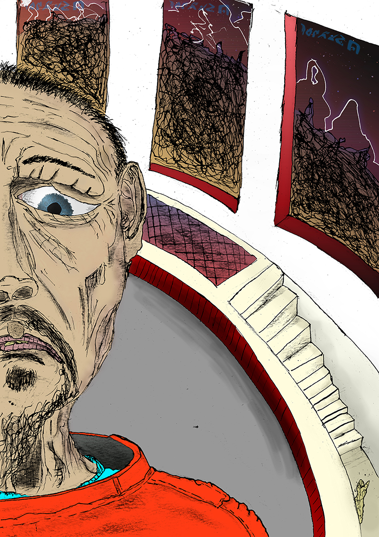
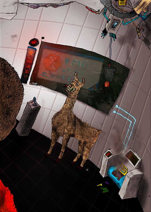
Mischellaneous Work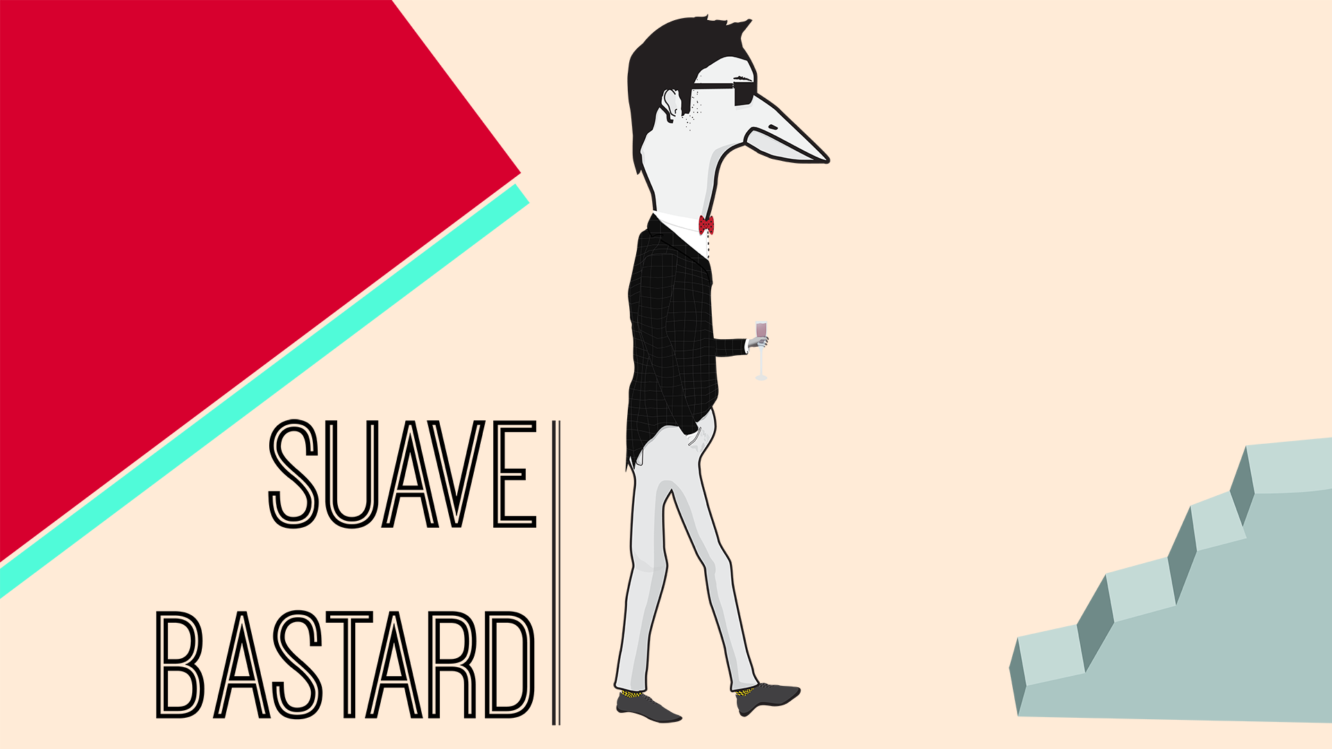

TBC[Event] Global Game Jam 2014 - Games
Hey guys, I'm the other guy that worked on Entwined. Also now actively participating in the discussions :)Thelangfordian;18233" said:Retief Fourie and my submission was Entwined, a maze puzzle style game where you play two characters navigating a level in turns, but the twist is that on the second phase, the first characters movements persist, and the two characters may not touch each other.
http://globalgamejam.org/2014/games/entwined
Big thanks to all those who organised. Big ups to the other devs, you guys are too damn good! The ideas and prototypes were amazing!
From my side, thanks again to all the organisers, what an epic event!
Also congratulations to all the devs /artist / other people. Great ideas, great games, great weekend!E: Reservoir - Build 0.4Solved it! Proportional Navigation was just the ticket.
http://answers.unity3d.com/questions/138749/proportional-navigation-guidance-logic.html
See how the cyan line is adding the correct amount of movement to counteract the forward momentum :)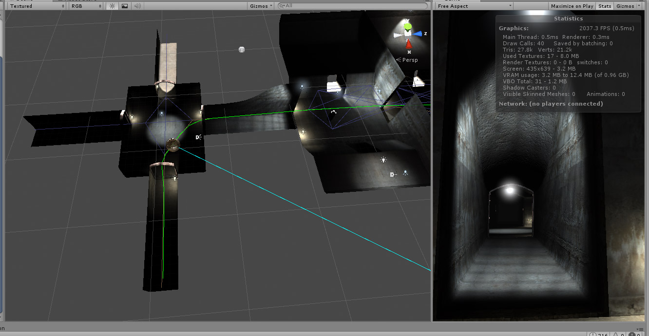 Slipper slope in single player games
Ah, but that's not what I was saying... I said that positive feedback loops provide opportunities for players to exercise meaningful agency that impacts the simulation. Negative feedback loops remove opportunities for agency. That agency still has to be constructed in the system as options for players and those options need to be made visible to players...BlackShipsFilltheSky;15233" said:Conversely, a slippery slope (towards a negative result) without effectively being able to rectify it can be disempowering and reduce player agency. As @Rigormortis experienced in Rome, or I experienced in Starcraft.
I don't think it's accurate to say a slippery slopes reinforces agency. I think they can though (as @Raithza experienced in XCom).
Your Starcraft example is a lack of awareness of options for agency available to you as a player. The system isn't at fault for containing positive feedback loops with adverse player outcomes, it's at fault for not telling you what you could do to change the paths of those loops.
That's very different to a slippery slope in a game - usually a slippery slope system involves small actions now having large adverse repercussions later. A slippery slope might start a positive feedback loop, for instance, but often that slope wasn't noticeable by the player when they started the chain of events in motion... I guess there are interesting things to think about regarding slippery slopes that are strictly started by player-responses (like not expanding in a game of Starcraft is the start of a slippery slope towards being under-developed and eventually trapped and starved) compared to automatic slippery slopes, like what happens when units attack on their own because they got baited out by an enemy, that happens without your intervention - and it's your intervention as a player there that prevents the slippery slope being disastrous.
I think the X-com approach is to make the slippery slopes unavoidable, but survivable if you ride them out and make it through to the stairs at the bottom.The five-cat-coder techniqueI heard this is a whats happening thread or somethings. NICE CATS!
Evan and I were in a car crashing this weekend. Still shaking from the adrenaline we busy talking about new game ideas about realistic car crash simulation and how brutally violent we could make it.
Oh turns out seatbelts aren't this stupid thing to make you waste time, turns out they really important. We T-boned the dude doing about 100. Was pretty badass. (+1000 to beard strength.)
Both cars were a write off. NOT OUR FAULT! :)
Also turns out evans car had actual predator blood in it. wierd.


 Beginning - fantasy-themed Interactive Fiction
 First Step in Making Games and HI !Thanks everyone for the input.
Its very similar to creative things, where its not the program but the person and idea. I will most probably go into the harder one of UNITY since it is one of the more flexible ones in the long run. Obviously I know next to nothing about the other programs, I just know that UNITY has APP development and Augmented Reality features which Ive had to commission out of Unity Developers in the past.
But I would totally start off VERY basic, even if its simulated 2D just to get the hang of things first.
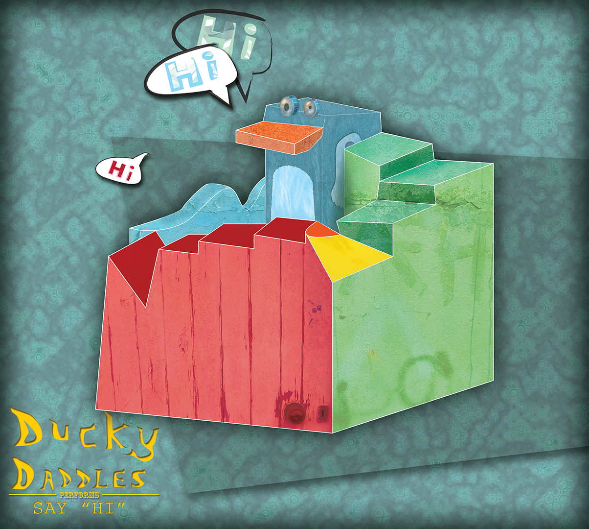
But on the art side of things, Im not much of an illustrator or such but Im a good designer and animator so, hey, wherever I can fit in, the for sure ! Heres a very rough idea ( old too ) of what Ive done before :Rooks Keep: Available now + GreenlightOh, and here are some screenshots!


 Luck in Games: NYU lecture by Richard Garfield
Very interesting lecture followed by a chat format on luck in games across electronic and physical games. And he has a podcast too, apparently. Worth following!zX - HyperblastUPDATE: Just a heads up on the new zX update:
Redesigned player damage fx so that it no longer uses Game Maker surfaces, thus better performance and compatible with more Gfx cards.
Improved particle and trail fx.
Improved option and pause menu system, inactive selections are now skipped over, all selections toggle.
Reworked audio levels so that the BGM is now more prominent.
Added 2 new music tracks to the green forest levels.
New weapon, charge attack a-la R-Type (hold down blade attack to charge and release to fire). Comes in 3 flavors contingent on current primary weapon selection.
...and just to brag a bit, I got a Twitter recommendation from Jeff 'Yak' Minter! Very chuffed about that :)
For those too lazy to scroll to the top, you can download it here
Also, check out this preview video by SlushyPreviews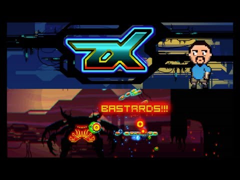 zX - HyperblastA new demo build has been uploaded. Get it here: http://dl.dropbox.com/u/23376639/zX-Demo.rar
New features include:
Infinite loop mode added, where the player tackles as many randomly selected levels it as possible before dying.
Completed level counter added for infinite loop mode.
Reworked and improved boss encounters.
Charge attack meter.
Player momentum improved.
Adjusted and streamlined pause and options menu.
Level exit portals added to the entrance of regular levels.
Numerous bug fixes.
Enjoy :)
Greetings all,
After implementing some great suggestions (thanks @BlackShipsFilltheSky), not to mention squashing numerous bugs, I am pleased to finally present you with the official demo of zX.
The demo features 11 playable levels out of the 66 total (excl. hidden levels).
Xbox and generic gamepad support has been integrated into the game. Xbox (and Logitech) settings are on by default. Generic gamepad users can change this setting in the options menu or the pause menu.
Keyboard controls can toggle between WASD (fire, blade & weapon select) / Arrow keys (movement) and Arrow keys (fire, blade & weapon select) and WASD (movement) which can be adjusted in the options menu or the pause menu.
Several new enemy types have been added.
New hazards have been added to several levels.
...and the game finally has music!
If you haven't yet done so... please vote on Steam Greenlight
Website: http://games.pandawlf.com/zx/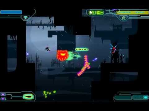 [Competition] A: Judging! Dum Dum Duuuum!After many months of reviewing the entries for "Competition A", myself and Bevis (along with some input from Filip Orekhov of Tasty Poison) have finished the judging, and here are the results!
We have tried to offer some criticism and praise for each of the images submitted. We have chosen a top 3, a most improved, coolest concept and most imminently usable. Hopefully this feedback will inspire entrants to challenge themselves with pixel art experiments/games in the future, and/or provide some practical advice for improvement. We apologize in advanced if any of the feedback seems rushed, we only had two months to put this together.
_____________________________________________________________________________________________________________________
Entrant 1: Zeratul by @Leorica
The strengths of this image, in that it is easily recognizable and faithfully rendered, are also its weaknesses. It looks very much like a well rendered image of Zeratul that has been shrunk down to 64 X 64. This would have worked far better at a larger size.
_____________________________________________________________________________________________________________________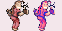
Entrant 2: Dan Habiki by @Pomb
What we liked about this is that it captured and accentuated the characteristics of the original Street Fighter character, as well as having been rendered in a very readable way. This image would work brilliantly in a Street Fighter demake.
_____________________________________________________________________________________________________________________
Entrant 3: Sven by @Pomb
Again this is a nice caricature of the original game character, but the rendering is a lot messier than in Dan Habiki. The use of dithering is not consistent, and in places the shading looks like the image has been skewed or resized (like on the sword). The saturation of the colours are a bit random, but on the whole it is still a very cool image.
_____________________________________________________________________________________________________________________
Entrant 4: Altair by @Bensonance
Saving the image as a jpg didn't help with the noisiness. Because there are so many layers of cloth on the character having some lighting/shadowing would have helped define the form better, but the character does have a good silhouette, tastefully chosen details and is easily identifiable. Very good for a first attempt!
_____________________________________________________________________________________________________________________
Entrant 5: Kratos by @TasticLuc
A very cool caricature of Kratos which accentuates his head and upper body and makes him look comically villainous. The line work is strong, but a bit lazily rendered in places and could have used a second pass to better define the forms. The shading is also very well executed but has an ambiguous light-source. A little extra love and this would have been awesome.
_____________________________________________________________________________________________________________________
Entrant 6: Cloud by @edg3
We liked that the sword is so big, because it makes this very easily identifiable as Cloud. The weighting of his pose has been lost from the original source, and his spiky isn't really conveying here.
_____________________________________________________________________________________________________________________
Entrant 7: Rat Ogre by @Rigormortis
This image could have been at a smaller resolution, there is a lack of detail as it stands. While this work went through a few phases and improvements, some of the changes weren't for the best, like losing the shading above the eye and suggestions of fur. The final product looks oddly clean for a Warhammer character. But the attempt to learn and improve is commendable.
_____________________________________________________________________________________________________________________
Entrant 8: Marcus Fenix by @duncanbellsa
The colours chosen here convey the grey/browness of Gears of War brilliantly. This image looks very lovingly rendered, the metal really looks like metal. The head isn't as recognizable or iconic as it could be.
_____________________________________________________________________________________________________________________
Entrant 9: Kha'zix by @skinklizzard
Some of the forms get lost in the near universal purple tones, the image needs more contrast. The rendering looks a bit crunchy, but the character very recognizable and the sense of perspective is strong.
_____________________________________________________________________________________________________________________
Entrant 10: Companion cube - @notsimon207
This looks like a companion cube.
Entrant 11: Gordon Freeman by @LittleBear
The silhouette makes him look like a robot. The colours are rich and appropriate, and the rendering is nice and clean, but the proportions are kind of off.
_____________________________________________________________________________________________________________________
Entrant 13: The Quest For Glory Dude - @Nandrew
This looks like a very affordable art style. This could work really well in a turn-based fantasy puzzle rogue-like.
_____________________________________________________________________________________________________________________
Entrant 12: Necron Warrior by @D3zmodos
This is cute and charming and very obviously a Necron Warrior. Again, it looks easy to animate and work with. The black lines could have been a little less generous.
_____________________________________________________________________________________________________________________
Entrant 13: Cate Archer by @Elyaradine
This is a very charming chibi rendering of Cate Archer. Elyaradine clearly understands pixel art and it's limitations and the resulting work looks like it could be put straight into a game. The shading is good, but the outlines aren't 100% consistent (giving her a mono-boob).
_____________________________________________________________________________________________________________________
Entrant 14: Limbo by @Kelga
The resizing down really crushed the quality on this submission. It looks very easy to use and animate, looks charmingly simple, and is very obviously the limbo boy.
_____________________________________________________________________________________________________________________
Entrant 15: Jade by @damousey
This captures the character of the game, and is well silhouetted and posed, but there are a few odd technical problems with it (some of which weren't apparent at first but were introduced during the process). Her pants in particular are kind of blurry and her facial features are hard to make out with all the different colours used in her face. The outlines are a little inconsistent, but on the whole she is very appealing.
_____________________________________________________________________________________________________________________
Entrant 16: Eddie Riggs by @Karuji
This is a nice attempt and we can see a lot of improvement. His clown shoes are a little worrying.
_____________________________________________________________________________________________________________________
Entrant 17: Gordon Freeman by @aodendaal
The pose is a little awkward. He seems to be standing on one leg about to fall over more than he seems to be walking. The colours chosen for his glasses make them hard to identify, but otherwise his head is quite nicely stylized. It is clearly Gordan Freeman and his trusty crow-bar.
_____________________________________________________________________________________________________________________
Entrant 18 : Katamari - The prince - @Ally
This is a very charming depiction of the Katamari character. The simplification of forms is very effective here. It looks very easy to use and animate in a game.
_____________________________________________________________________________________________________________________
Entrant 19: Star Wars the old republic by @Actrox
Illustrating this huge and resizing it down was not a good idea. The final image lost a lot of its definition, like the white glowing centres of the light sabres and the deep reds of his eyes. That said we can see a huge improvement from where this concept began and Atrox seems to have learnt a lot through the criticisms the community offered and his own experiments.
_____________________________________________________________________________________________________________________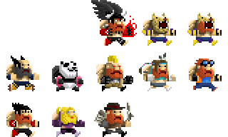
Entrant 20: Tekken dudes by @Tuism
Lots and lots of cool ideas and inspiration. The shear amount of beard included is commendable. These don't actually depict the characters from the Tekken games, but are really dwarves themed as Tekken characters. We would love to play Angry Dwarven Street Battle when it comes out.
_____________________________________________________________________________________________________________________
And the judging is as follows!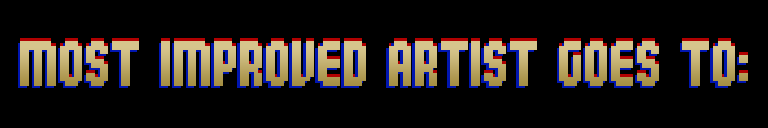
ATROX!

CATE ARCHER!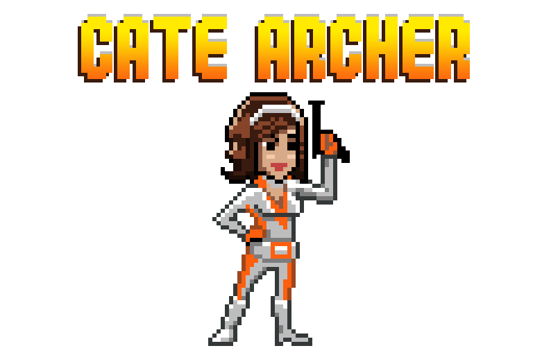

CATE ARCHER! (again)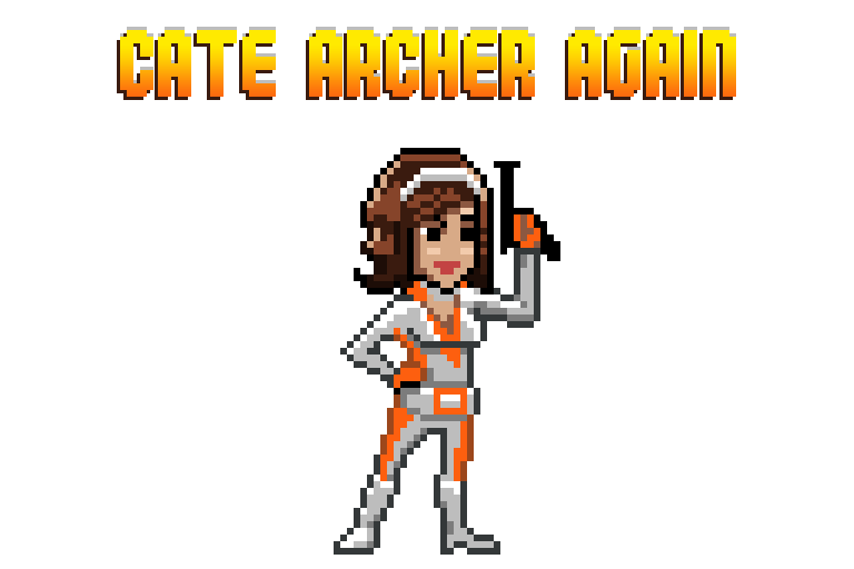

KATAMARI!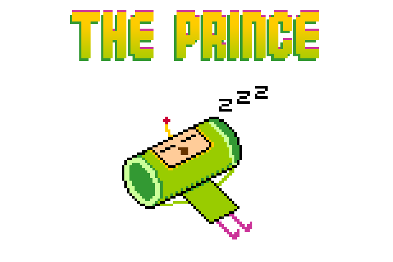
MARCUS FENIX!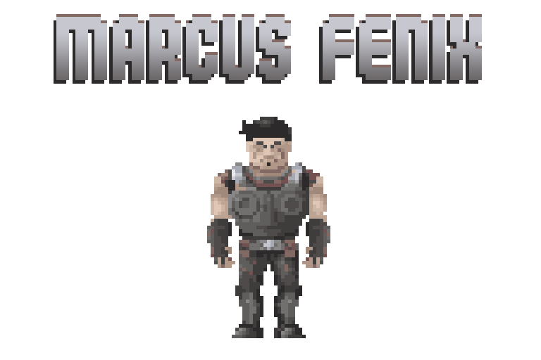

KRATOS!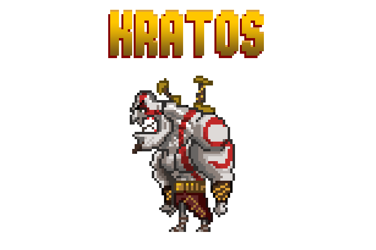

CATE ARCHER! 
DAN HABIKI!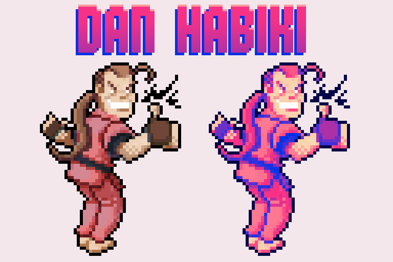
 Yeah, this seems totally reasonable...Yeah I agree. Noone wants to be Man With Phone #3, but Man With Phone #3 didn't know he was in a game. If I knew I was in a game I'd be one of the 100000 Neos.
Which would make me Flying Man With Shades #12334. Sounds like another MMO. I dislike MMOs.B: Power & Toughness(Updated 2012/11/09)
My latest version of my prototype (damage now works, so does the reshuffle when your deck runs out (buggily) grab a friend and play in 2 player!)
Download Windows zip file (2mb) (sorry I haven't got the web player license yet!)
It's what I thought reductionist Magic The Gathering would be... I wanted to make it like a Tetris-paced game, like a puzzle, more drop-the-blocks game than a slow-and-deliberate turn based game.
The basic premise is that you have a deck, and play cards one at a time into one of 5 lanes. Win condition is taking out 3 of the 5 of the opponent's castles.
The controls are dead simple - arrow keys and WASD, that is all, for the two players. Your gold builds up over time, and you spend that gold to deploy your card. Gold caps at 10.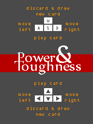
(Imagine my shock and horror when Daniel told me how Mojang's Scrolls worked. TOO similarly. I thought I'd ignore all info on that and just carry on with my prototype.)
Stuff I still want to do:
> Abilities like Flying, Explosive, Buildngs, Regenerate, faster income, Running, etc.
> Basic AI
> Progression through different mechanics, unlocking more abilities
> BALANCE
The idea is that the game can work - even multiplayer - on a tablet device. I love multiplayer face-to-face. Adds so much to the interaction. But also love a single-player experience that lets you explore and learn mechanics.
Questions:
1. What do you think of the mechanic, is it worth persuing...
2. ...especially considering it's very close to Mojang's game... (poo)
3. What would you like to see from a game like this?
4. Is it simple enough... Or too simple?
5. Any thoughts on the balancing?
Thanks for having a look! Promise I'll make it work better :)Robolegs - Mech FPS(I think his rocketjumping is more a function of his demoing the game than it being a final game mechanism? I may be wrong though :P)
That Waiting for Horus game looks like so much fun to play, the effects and explosions are fantastic despite being lo-fi. Robolegs needs bigger effects :)
Metal Jacket's been used a few time yeah. Full Matel too. Naming can be difficult, but I think it's important to be...
Style wise, are you aiming for more Mechwarrior or more Full Metal Panic, or more Scope Dogs? Or Armored Core? (omg that stuff is like so much eye candy, I love making AC mechs)
Again, are you looking for art in terms of interface design, mecha design, box art, 3D, texturing, everything, or something more particular? Let us know and we can see if we can be part of it :) I know I would love to be :)
And when's your "in-time" deadline?Vote for Association NameFinal Results are in! We have a name :)
With a simple majority win, thew Association will be called Make Games South Africa
Thanks for participating everyone, and I hope to see you at the AGM!
*******
Results are in:
28 Votes in total, top 3
MakeGamesSA 50% (14 votes)
South African Game Developers Association 21.5% (6 Votes)
Game Developer's Guild of South Africa 17.9% (5 Votes)
There were three votes for other names, so new poll is running (from tonight) for the top 3. Poll closes this Friday.
Whatever wins the poll will be the name of the association
Go Vote!
***********
Hi All,
I've created an online poll for the name of the association. The poll closes this Friday (August 10 2012) at midnight. Top three names will be made into a new poll which will run the following week, the winner of this poll will be the name. If only three names (or one or two) are voted for during the preliminary round, then the name with the most votes will win.
The poll is available HERE
Go vote!


