Pieter Visser's Art

Greeting everyone.
For those whom I haven't had the opportunity to meet, hi I'm Pieter Visser :) I am a video game artist and I have been practising my trade for just over a year now, and I can honestly say, best year of my life.
My past experience consists of creating 2D assets as well as character portraits for a various games. Even though my strong suit is art, I also really enjoy prototyping ideas (my most recent of which is Overdrive), and I have a particular weakness for anything generated procedurally. They just happy mistakes so much :D
I'm open to any collaborations, be it a prototypes, demos, game jams or release titles. If you think my art can help improve your game, let me know and we'll talk pixels.
Published Games:
* Chronoblast on XBLA
* Gloobies Lab on Google Playstore
* Crazy Mazey on Google Playstore
Games still In Development
* Chronoburst for PC (Video)
* Seedscape on Steam
Below are some examples of my most recent work, and I'll keep adding to this thread as time goes on.
Hope everyone can find something they like :D
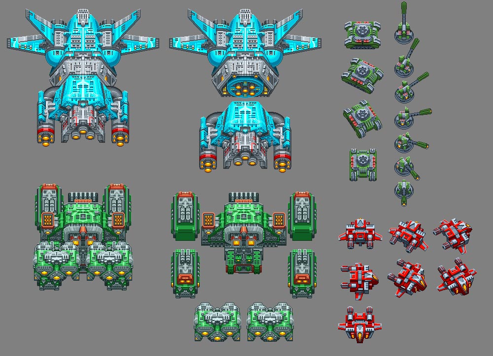
Sprite work done for Overdrive.
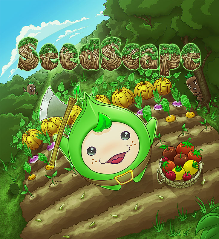
Cover design done for Seedscape. (Yes, I draw cute things too :3)
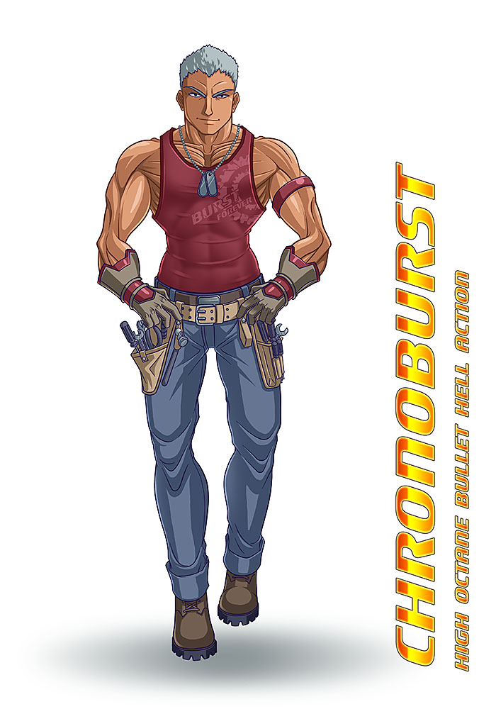
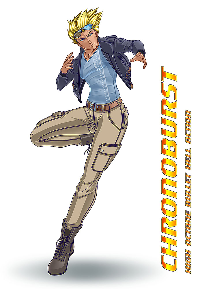
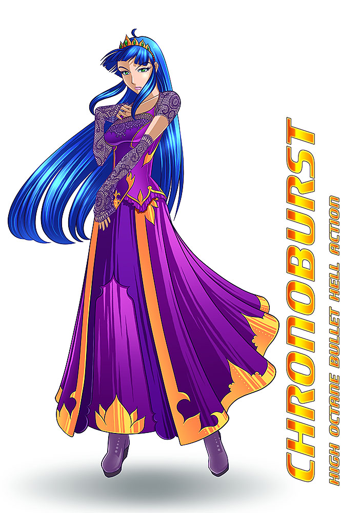
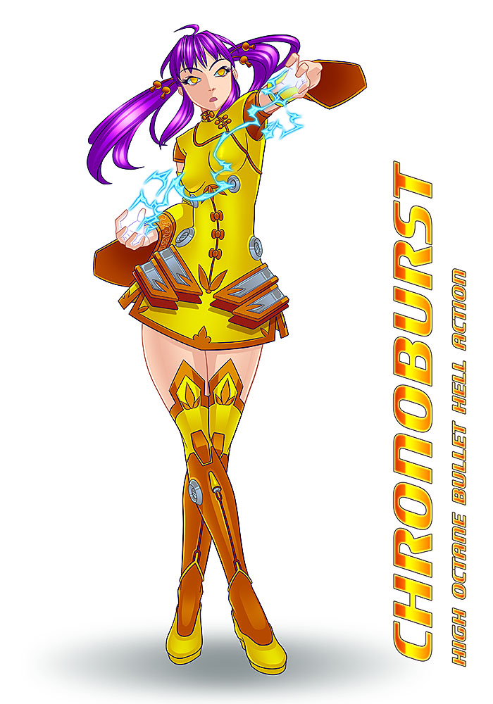
Sprite work and character designs done for Chronoburst.
For those whom I haven't had the opportunity to meet, hi I'm Pieter Visser :) I am a video game artist and I have been practising my trade for just over a year now, and I can honestly say, best year of my life.
My past experience consists of creating 2D assets as well as character portraits for a various games. Even though my strong suit is art, I also really enjoy prototyping ideas (my most recent of which is Overdrive), and I have a particular weakness for anything generated procedurally. They just happy mistakes so much :D
I'm open to any collaborations, be it a prototypes, demos, game jams or release titles. If you think my art can help improve your game, let me know and we'll talk pixels.
Published Games:
* Chronoblast on XBLA
* Gloobies Lab on Google Playstore
* Crazy Mazey on Google Playstore
Games still In Development
* Chronoburst for PC (Video)
* Seedscape on Steam
Below are some examples of my most recent work, and I'll keep adding to this thread as time goes on.
Hope everyone can find something they like :D
Sprite work done for Overdrive.
Cover design done for Seedscape. (Yes, I draw cute things too :3)
Sprite work and character designs done for Chronoburst.
Comments
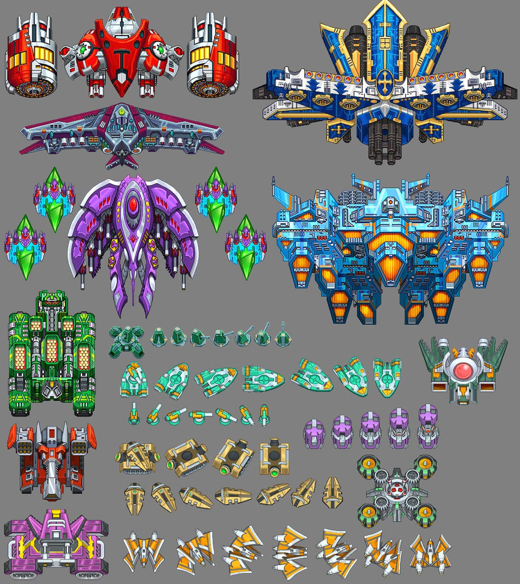
The sprite work lacks a good focal point on each element, meaning that if this was on a screen in game, there would be difficult translation for what is important to the player, There's a reason people make guns glow or 'weak points' massive and unsubtle, the elements should have values that are very quickly identified by a quick view, this is why we don't write black text on a grey background. But literally the ships are the best of what I see here.
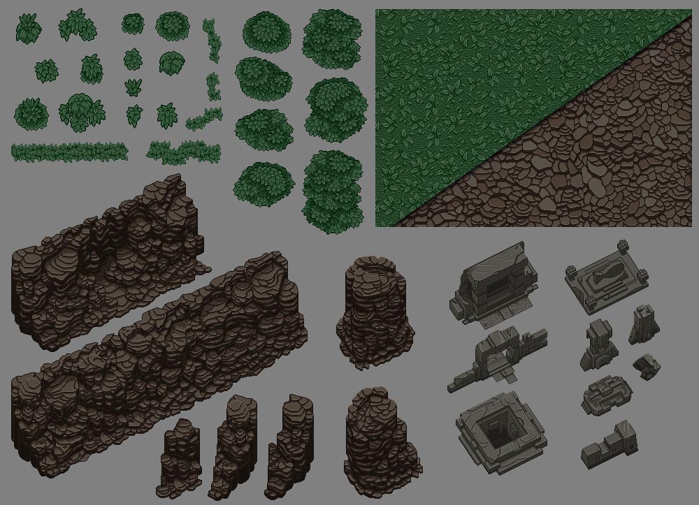
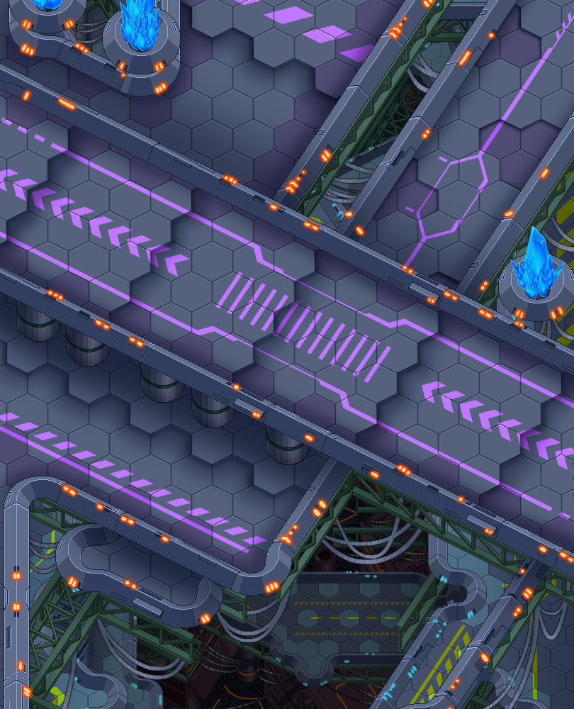
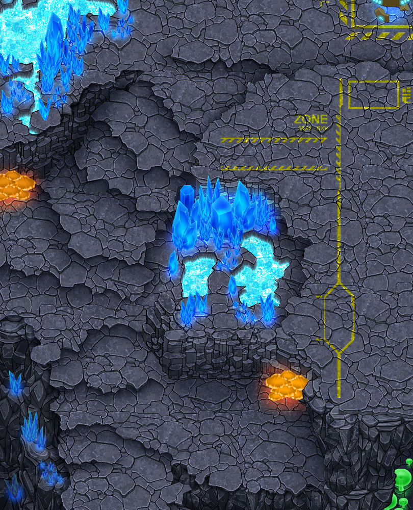
The environmental tilesets are super sweet, however they are possibly too detailed, a ground texture should not have severe contrast in colours as they are literally distracting to more important elements, like characters, as the crystal images show, there's too much noise around the crystals to give the crystals a strong presence. As mentioned, the skill is there, but it needs fine tuning to be used in game most efficiently.
And now's that awkward time when I look at character designs, Look I am a really difficult sell when it comes to anything inspired by anime, but this is truly because it makes some lazy habits in design. I'm not going to waste my time on stylistic aspects and the problems with anatomy or whatnot because we have Super deformed game characters amongst our most beloved (mario, limbo kid) But these characters scream generic and lazy and lack basic rules of identity...
Dota 2 Art guide
Firstly: take a look at the dota 2 art guide for the workshop.
silhouettes are important, and these are all the basic body structure with tiny details added to them sticking out, there's a reason Cloud strife has MASSIVE hair, MASSIVE POINTY SWORD and stands next to wide body'd tiny legged Barrett in character lineups, they stand out as unique characters on the most terrible of monitors.
About those tiny details: they only make further steps harder when it comes to animation and making assets when every angle has finicky design extras on them that add very little.
and lesson 2: adding visual interest, Values are super cool and really easy to get into, tonally I'm seeing hair and dresses at the same tone and characters with grey hair wearing grey clothes, this translates prettimuch not at all... same rules as apply to environments except you want to be loud there, not more subtle. Makes for a game looking great.
Sorry if that's brutal, I love seeing more artists, but always feel we need to be kept in check amongst all these programmers who most of the time are a little clueless on what works and what doesn't. Keep up the work! and feel free to rip into my work if I can improve certain aspects.
I have put together a "Shoot em Up Starter Pack" for all MGSA users containing pretty much everything you would need to create a Shoot em Up game. It is free for use in non-commercial projects, so prototypes, game jams, personal projects etc, go nuts. I can't wait to see what you guys and gals cook up :)
Download the pack here:
MGSA Shoot em Up Starter Pack
Practise everyday, even if it's just for 10 minutes, and you WILL improve. Keep that fire inside you going, only you can make your art.
(Then: 2007 -> Now: 2015) Slow but steady progress ;)
Leaves & rocks added to my design reference - very nice shading work.
I find design "rules" to be super thumb-sucky, but it's something that works quite well practically, even if the justification seems to change a bit depending on whom you're talking to. :P
I really like the vibrant colours in your work, but I do find that when I look at a screen of your sprites it's very noisy, and if you offered areas of very low detail, it'd make your detail work look better. I don't agree that cleaner is always better (sometimes it just looks cheap), but I think that having some cleaner areas would be more appealing.
Keep it up! :)
Looking at your characters: the best by far is the girl-in-ghost-outfit & guy-with-shades. Sober palette choices, good tonal contrast, and most of all, solid areas of non-detail. Poses and anatomical relief also make a difference, but not as much as the sculpted nature of these characters. The worst is the guy with twin holsters: too much linework / variation on skin, jeans. This immediately detracts from the impression of form that the viewer gets. It makes the eye work harder.
Some of your large ships have wonderful form, but it is not as evident as it would be, were they less detailed.
So - you have no problem with creating massive amounts of detail when you need to, that's great. The next step in improving your style is to learn to scale that tendency back toward simplicity and elegance.
There was something that bothered me the whole time I was making them too. I knew it was a contrast thing, but I thought that I would just make the pallet more contrasted, but that didn't seem to solve it. But after reading your critiques it just became so clear, I need to vary my details to help create contrast and areas of interest. Currently your eye doesn't know where to focus.
I'm busy working on the next set of sprites, and will give extra attention to where I provide details to help provide interest and contrast.
Thanks again for the keen insights! Level up, level up!
Ps, I'm working on a new background tile (Crystal / Mushroom Caves theme). Too busy as well?
What you did so well with the shale-like rocks, the shadowing of elements underneath, might see minor application here by applying them as a cut-out from the gloss lines, suggesting that light doesn't fall there. Taller prisms could easily be indicated by more of those dark horizontal lines you have at the top of each prism at the moment, indicating a greater degree of exposed crystal above the surface. Looks like the Giant's Causeway in amethyst! ;)
P.S. When I look at the nice crunchy pixels of this image I am very tempted to scale up x2 or x3 and rework from there for finer lines, while keeping the tanks the original size. It would seem to do justice to the crystals.